Spartafit Icon Illustration 💪


Hi Guys! 👋
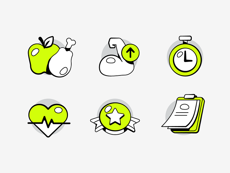
I made this exploration of illustration on previous apps called Spartafit! you guys may notice that this icon have different stroke width. Yaps thats correct, this is because the icon want to looks fit with the style guide that looks like e-sport style and want to bold the masculinity of spartan. You can scroll that i made the same weigh of stroke below
As always, let's scroll!
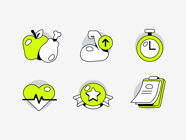
Same Stroke Weight
you can see here the stroke was consistent looks clean but not fit into brand style which want to look bold and more illustrative. So i make them with different stroke weight to enhance masculinity look, as always i attach the sketch below 💪

Thanks for checking it out!
Interested in partnering with us?
Say hello at hellodama@odama.io
or visit our website odama.io
Check us more at:
📷 Instagram | 🛒 Gumroad | 🎉 Figma Community | 🛍 Creative Market


