Crypto Currency App

Overview
Cryptocurrency often appears intimidating to many, as the idea of digital currency can seem somewhat elusive. Understanding how to engage in transactions with virtual money and, even more so, how to leverage it remains a significant challenge for many. Nevertheless, a growing number of individuals remain interested in diversifying their investment portfolio beyond the traditional mix of stocks and bonds.
Value Proposition
Bitfolio is an app that empowers individuals to effortlessly acquire knowledge, make informed investments, and gain a comprehensive understanding of cryptocurrencies, all while streamlining the often intricate and daunting aspects of the crypto space.

Problem
Recently, the cryptocurrency market has seen a huge increase in interest, and this growing enthusiasm for digital assets has highlighted the issue of overly complex cryptocurrency apps, which can deter potential investors.
Goals & Objectives
The main objective is to create a user-friendly cryptocurrency app that simplifies the current complexities and makes a strong impact in the market.
Solutions
Simplified crypto currency application
Less steps to get to trading
Less complex stats
Tutorials and information about crypto for beginners
Market Analysis
An extensive exploration of other applications in the same domain allowed me to discern their strengths and weaknesses through the perspective of individuals entering the cryptocurrency market for the first time.
I focused on two of the most used crypto apps according to Forbes.

Coinbase
While the app has a user-friendly interface for beginners, it shows a somewhat dated appearance.
The app offers a comprehensive range of features. However, certain users may encounter challenges, particularly when it comes to purchasing and trading, often attributed to geographical constraints.
Trading fees on Coinbase exhibit a degree of complexity, contingent upon the specific trading tool selected. The platform provides both a basic and an advanced trading option, each associated with distinct fee structures.
Additionally, some users have reported financial losses due to perceived ambiguity within the application.
Kraken
The app presents a cleaner, more contemporary user interface that attracts beginners. However, it also comes with a set of drawbacks, including high instant buy fees, a limited selection of educational resources, as well as withdrawal fees, and high minimums.
Although the app primarily targets beginners, certain sections require enhanced clarity, notably the support section, which lacks organization and a user-friendly approach compared to other parts of the application.
Furthermore, a concerning issue is the occurrence of user-reported losses stemming from security breaches. Users have shared their experiences of costly hacks with minimal support or assistance from Kraken.
Other Options
I've come across excellent competitive options such as Robinhood and Public, known for their user-friendly, modern, and streamlined investment technology.
User Personas
The primary focus is on individuals who are new to the crypto market and seek a simplified and straightforward process for registration, learning, and commencing their investment journey.

Defining Important Tasks
After conducting a thorough competitive market analysis and empathizing with the user persona, I crafted a user flow with the primary objective of streamlining transaction completion steps, keeping it as simple as possible.

Wireframes
These wireframes exemplify the prospective look of the main screens, presenting a straightforward yet efficient layout.

Visual Design
Cryptocurrency appeals to a contemporary audience with a keen interest in expanding their investment portfolio through cutting-edge technology. In line with this concept, the app's visual design seamlessly adapts to both dark and light modes, offering a versatile and personalized user experience.
The overall aesthetic exudes simplicity and sleekness, aligning perfectly with the goal of simplifying the user experience in what can be an otherwise intimidating and confusing process.
Visual Components

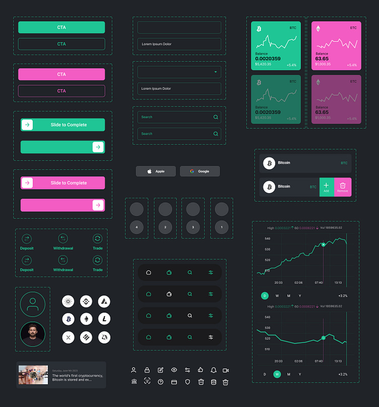
UI Kit / Design Systems
High-Fidelity Mockups

High Fidelity Prototypes
Onboarding
Fast, secure, easy, and insightful, the main onboarding features include:
Phone verification code requirements.
Face ID set up for faster and more secure log-in.
Opt for an engaging introductory video tour to help new crypto enthusiasts become acquainted with the app and ease any feelings of intimidation.
Home Screen
The main home screen features include:
Prominent Display of User Investment Information.
Comprehensive Compilation of Up-to-Date Market Rates.
Access to In-Depth Insights on Every Coin.
Seamless Access to Educational Resources.
Effortless and Swift Cryptocurrency Transactions.
My Wallet
The main "My Wallet" features include:
Seamless Access to the User's Assets per Coin.
Comprehensive Coin Cards with Visual Charts and Key Metrics.
Real-time Updates for Keeping Track of Transactions..
Usability and Testing
Following the creation of the initial prototype, it was presented to users for evaluation with a set of questions and actions to take. After this process, users provided very insightful information that helped improve the overall design and usability.
The following changes were made and were already implemented:
The home screen underwent a substantial simplification, focusing exclusively on presenting portfolio and investment information. Initially, I included additional valuable content like news and educational materials, but it inadvertently caused some minor confusion.
In addition to an introductory video, I Incorporated a simple but prominent entry point on the home screen that grants effortless access to the videos and tutorial section. My goal is to provide a sense of reassurance and build trust with users, particularly those who may feel overwhelmed when first encountering the home screen.
I've standardized the color palette of cryptocurrency icons. By replacing their original, varied colors with a uniform, neutral palette, to ultimately reduce visual clutter.
At first, the wallet cards closely resembled the primary graphic on the home screen, leading to some user confusion upon accessing them. Consequently, I made the decision to introduce cards with solid backgrounds and visual graphs, offering a clear visual distinction and enhancing their identification as separate entities from the homepage.
Originally, the primary navigation was positioned as a side navigation hamburger menu. However, following valuable feedback from users, I made the strategic decision to introduce a bottom navigation bar instead, enhancing both accessibility and user experience.
Takeaways
As someone who initially felt quite intimidated and had very limited to no knowledge about cryptocurrency, embarking on this project proved to be both challenging and, simultaneously, a valuable learning experience. Ultimately, my primary goal was to acquire as much knowledge as possible to ensure I make informed decisions that result in a user experience tailored to our users' specific needs.


