Istrica - Olive Oil Logo + Packaging Design

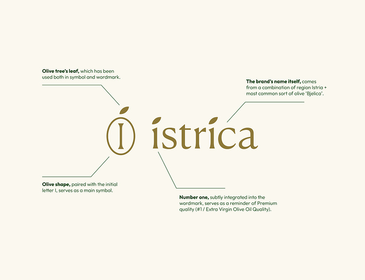
We've made a new logo design, identity system, packaging labels and website design for rebranding of our Croatian extra virgin olive oil - Istrica. The brand name comes from Istria (region) + Bjelica (the most common olive sort there).
In the final round, we tried to put more emphasis on the unique wordmark and then expanded that to the standalone symbol as well - a combination of letter I + olive.
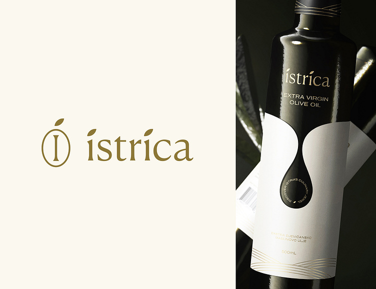
The packaging is handcrafted with a specific drop shape representing olive oil, paired with a lovely golden foil showcasing Istrian fields.
Feel free to reach out anytime for a free brand consultation:
Skype: Insigniada