Paramolz Visual Identity Case Study

Last year, we had the privilege of developing the branding for a pharmaceutical raw material e-commerce brand. Our team at DELIGION meticulously crafted a brand identity that resonates with the core values and vision of the business.
Overview
Paramolz, an innovative pharma eCommerce platform, revolutionizes raw material distribution for medicine manufacturing.
Challenge
Paramolz needed to stand out in a crowded market without resorting to the industry's typical molecular imagery.
Solution
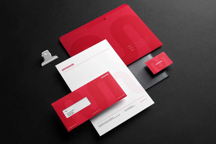
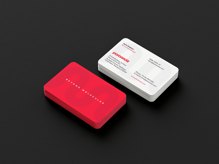
The design team developed a unique wordmark logo incorporating circular forms to symbolize innovation and the fluid dynamics of pharmaceutical processes, effectively setting Paramolz apart in the market.
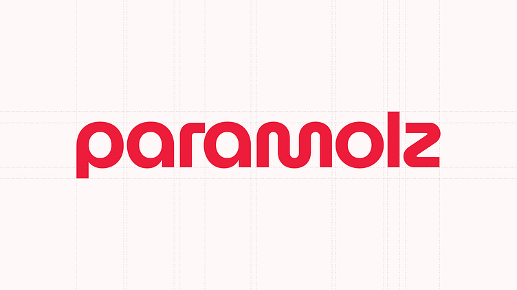

Moving beyond common industry clichés, the design merges modern aesthetics with functional typography to capture the dynamic essence of pharmaceutical processes, distinctly positioning Paramolz in the eCommerce landscape.
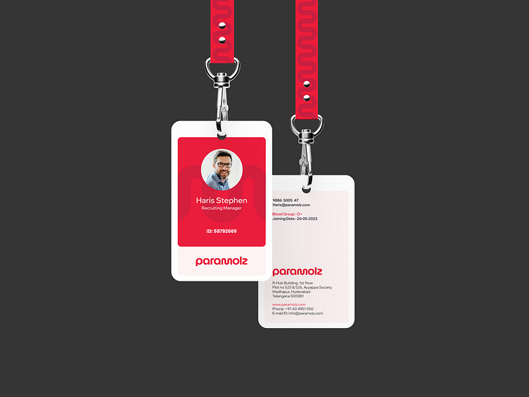
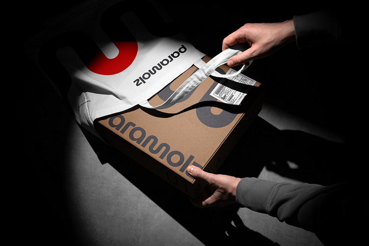
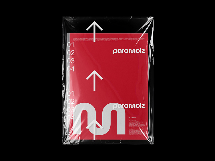
The 'm' in the Paramolz wordmark was developed into a distinctive brand symbol. This design choice not only emphasizes the brand's focus on molecular excellence but also aids in creating a cohesive visual language that extends across all brand touchpoints.