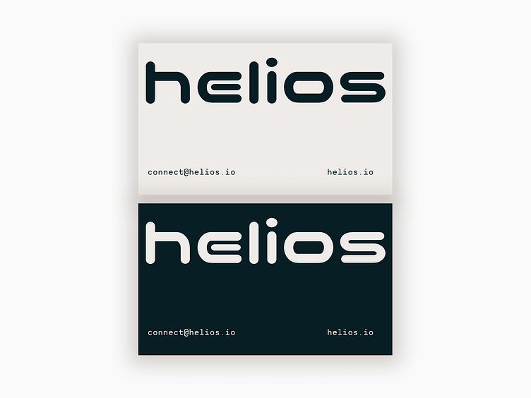
Helios

This is a mock up for a brand looking to capitalize on intrigue and draw people in. Typically I focus on providing all of the necessary context to make it easy for people to quickly understand 1. who you are 2. what you do and 3. why you do it right off the bat, but with this project I wanted to create a sense of mystery and invite them to learn more by driving traffic to their website.
In addition to the curiosity piqued from the lack of information shared, the futuristic main font (Nico Moji) acts in juxtaposition with the monotype secondary font (Necto Mono) to create balance, keep it grounded, and adds to the intrigue.
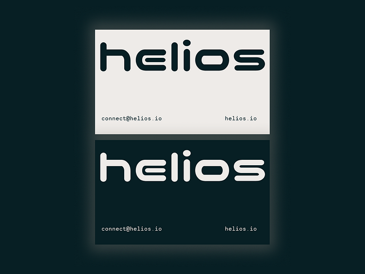
This is a continuation of my exploration of simplicity and letting typography speak. I think typography is such a fun aspect of design and while there are certainly times where it's not up to the job of carrying an entire design, I think there are instances where it can be super exciting. So far, it's resulted in more simple designs and somehow I'm still surprised at how impactful, bold, and feeling-evoking even just a hero font and duotone color palette can be. I'm not saying I want to ever get to the point where I'm solely relying on typefaces in branding or graphic design (and I have no desire to be an especially minimal designer), but I do think there are so many interesting ways to play with spacing, format, composition, and cases that create the opportunity for it to really shine and I'm having fun exploring it.
More development on this design to come ( :