12/32 – Charlotte Royals

Rulers of the Kingdom
The Atlantic Division concludes with the Charlotte Royals, team number 12 in this series.
The Royals have been a fairly consistent team throughout history, reaching the playoffs in 5 of the last 6 seasons. They have one UFL Championship win in Season 6 where they dismantled the Austin Lonestars. Some twenty seasons later, they would see the other side of that coin being blown out in Season 26's Ultimate Championship, a loss the team is still trying to to bounce back from.
Visual Direction
Named after queen Charlotte of Mecklenburg-Strelitz shortly after its incorporation, the "Queen City" fittingly adopts the "Royals" nickname for its fictional franchise. The visual identity is built around a crowned lion, an animal associated with power and royalty and in heraldry frequently incorporated in a nation's coat of arms.
Additionally, the first significant gold rush in the United States is claimed to have occurred just east of Charlotte which prompted the establishment of the country's first U.S. mint, founded a few years before the historic California Gold Rush in the mid-19th century.
Shades of royal blue and gold make up the Charlotte Royals' color scheme.
Execution
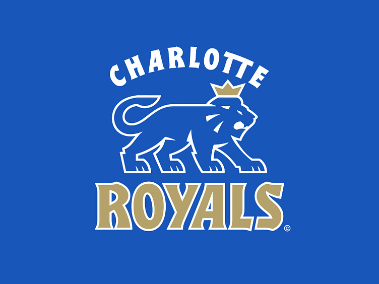
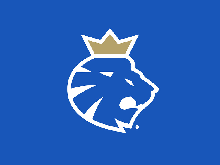
The primary logo depicts a stylized, gold-crowned, blue lion in silhouette with its open mouth forming a "C" shape for "Charlotte". While the actual crown that inspired the identity is more elaborate in design, a more simplified route was taken for the design of the Royals.
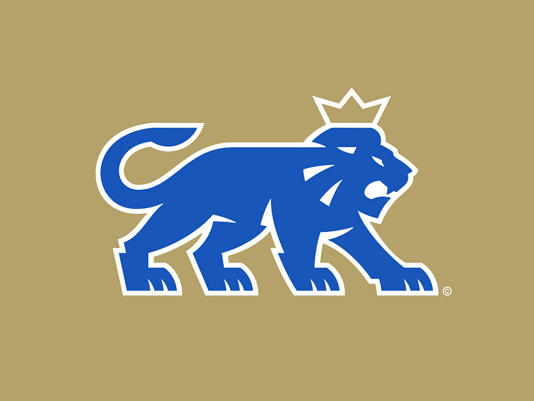
A full-bodied version of the primary lion takes the throne in the secondary spot. Categorized as a "statant lion", this creature is on all fours readied for attack with its tail curled up to form an additional "C". This logo is paired with the team wordmark to emulate a heraldic-inspired lockup.
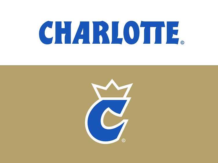
The tertiary logo is a crowned "C" taken directly from the location wordmark. The terminals of the letter mimic the of the lion's mouth in the primary and secondary marks.
The team typography is heavily inspired by the blackletter style, emulating the calligraphic nature with a sportier spin. Letterforms incorporate curves where the stroke would bend and serifs where the pen tip would lift that nicely reflect some of the linework in the lion logos.
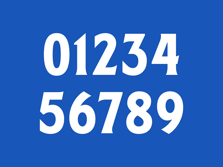
Charlotte's jersey number set carries out this style in a more reserved manner. While the execution is similar, the letterforms have more Roman-like cues that evoke a luxe appeal.
Fight for the Throne
The Charlotte Royals now have a rich and refreshed visual identity that pays homage to the unique origins of the city, packaged in a bold new graphic suite.
Football Helmet Mockup by SportsTemplates
____________________


