Air Link Taxi and Limo Logo Design Concept

The design concept for the Air Link Limo and Taxi logo thoughtfully integrates various elements to depict the services and efficiency of the company. Each component of the logo is carefully chosen to convey specific attributes of the business.
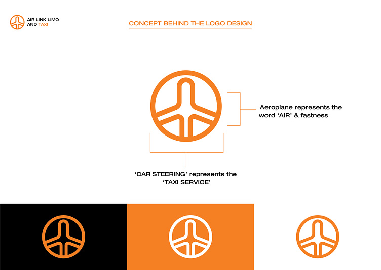
Aeroplane Icon: The central part of the logo features an airplane, which directly relates to the "Air" in the company name. This symbol is not just a literal representation but also implies speed and efficiency. It communicates that the company offers fast services, particularly valuable for clients heading to or from the airport.
Car Steering Wheel: Encircling the airplane is a design that resembles a car steering wheel. This element is crucial as it represents the taxi services offered by the company. The steering wheel symbolizes control and maneuverability, suggesting that Air Link Limo and Taxi provides customers with reliable and flexible transportation options.
Circle Shape: The entire logo is enclosed in a circle, a shape that often symbolizes unity and completeness. In this context, it suggests that the company offers a comprehensive range of services meeting all the travel needs of its clients. The circle also helps make the logo more recognizable and visually appealing, ensuring it stands out in advertisements and on vehicles.
Color Scheme: The choice of a bright orange color for the logo is strategic, as it grabs attention and stands out in the visual landscape. Orange is associated with energy and enthusiasm, aligning with the brand’s dynamic approach to service.
This logo is designed to communicate the dual aspects of Air Link Limo and Taxi’s business—air travel connectivity and ground transportation. It merges these services into a single, coherent brand image that is both functional and memorable, aiming to appeal directly to travelers who value efficiency and reliability.


