NORMA - pasta fresca

Norma is all about pasta. In Krakow's lively food scene, NORMA was one of the first spots to serve fresh, handmade pasta right before your eyes. They set the standard before pasta fresca was even a thing.
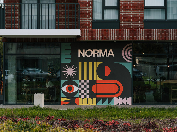
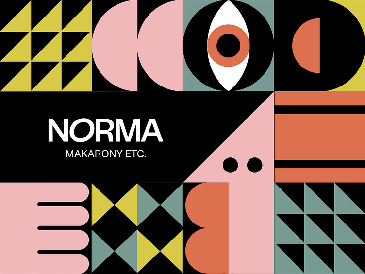
The name NORMA – in polish slang means normal, regular, everyday stuff. Norma is also the name of famous Sicillian pasta. For the owners, the vision for this place was clear, the place was supposed to be fun, mundaine,unpretentious... but also super easy to remeber.
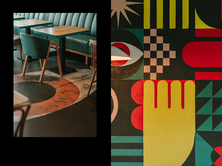
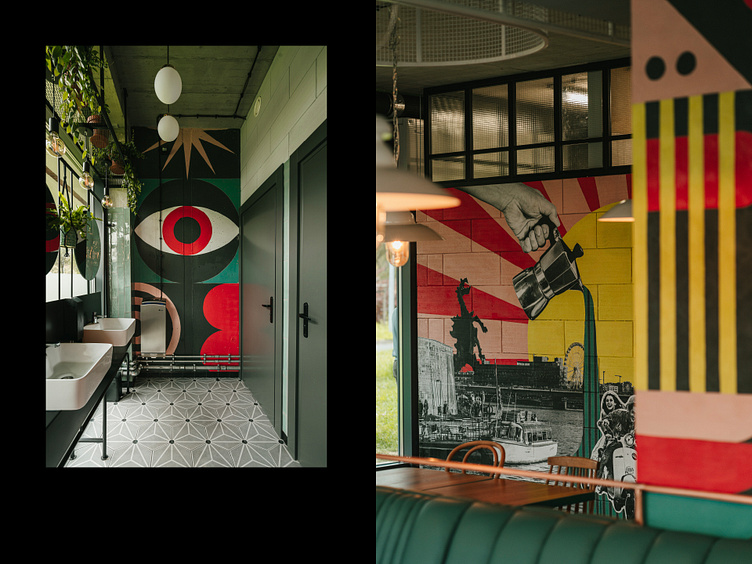
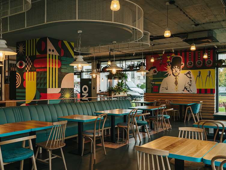
Our inspiration? Sicilian street art and those vibrant pops of color that make you stop and stare. We wanted NORMA to have a bit of that playful spirit, so we designed modular graphics mixed with colorful murals. That became super recognizable amongs other pasta places.
Our branding included:
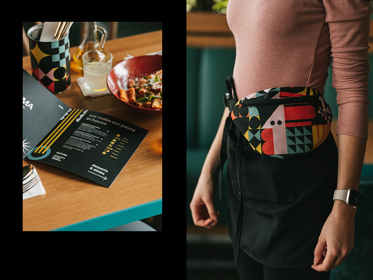
Visual strategy, logo, key visual, wall decoration, signage, packaging, uniforms, prints, www and social media templates.