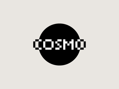
3rd logo for COSMO
Third proposal for cosmo.
The use of black and white takes up the minimal style of music. In the logo, the cosmos name is transformed into the ring of the planet, which takes shape thanks to the positive / negative optical effect of the name.
_____
www.antoniocalvino.com
Social Links:
Facebook | Instagram | Behance | Ello | Twitter | Linkedin | Pinterest
brand
branding
cosmo
design
dribbble
graphic
graphicdesign
inspiration
inspire
logo
logodesign
logos
marks
minimal
music
planet
symbol
tecno
trademark
typography
View all tags
Posted on
Dec 15, 2018
More by Antonio Calvino View profile
Like


