N (without u)


Nu Bank conceptual (& fictional, of course) rebrand exercise
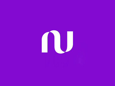
I've been staring at this logo for a while, I must confess: I do like ambigrams, and Nu logo is a great example since their previous wireframe/stroke version.
But, despites I can understand the visual link with the original one, the actual logo seems a bit repetitive to me. So I just wanna try this idea and see if works, instead of two same shapes representing two different letters, in/out composition (what make a lot of sense, values transaction company); merge both in a single lette, the N.
This is basically just a graphical exercise of simplification, optimization of the actual mark; I do love it actually.
I don't know if this works nicely in English, but have some kind of dialogue with N things, anything; IDK. I think you can still ready Nu in my suggestion, but a sýmbol as a single letter seems righter to me, more compact; still sugestion movement and the "exchange" idea, but with less graphic shapes and IMHO less confusing.
Let me know if you like this visual solution! Why not?!
Need a logo, illustration or other crazy stuff? Email me now :)
-
Follow & Connect!
Behance • Instagram • Facebook • Twitter
Thank you, I hope you like it :)


