brodsky | be good | landing

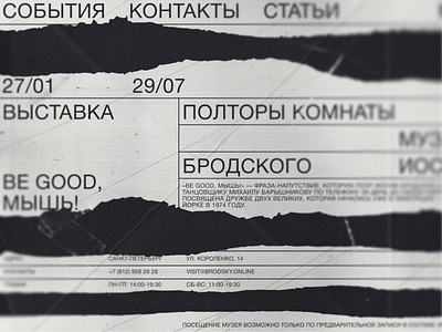
An example of a structural composition, when the basis is clearly verified typography, and empty space (in this case, chaotic stripes) create a rhythm and the necessary pauses.
And yet, I am absolutely delighted with the site of Joseph Brodsky - https://brodsky.online/
A cool example of how sites should look like in the style of Muller-Brockman, whom I just adore :)
The idea is based on a poster of a Netherlands graphic design studio.


