Egnosis logo concept V1

Hey Dribbblers,
During the Egnosis rebranding and logo design process, we came up with a bunch of different concepts.
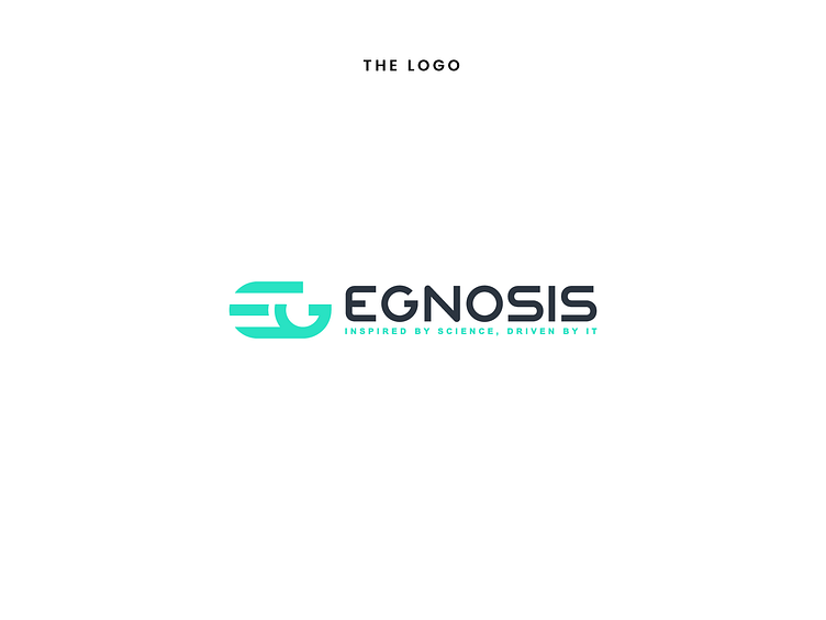
Here's one we showed the client!
We'd like to hear your thoughts about it.
This concept was called
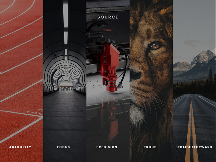
Stand out
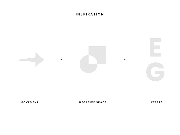
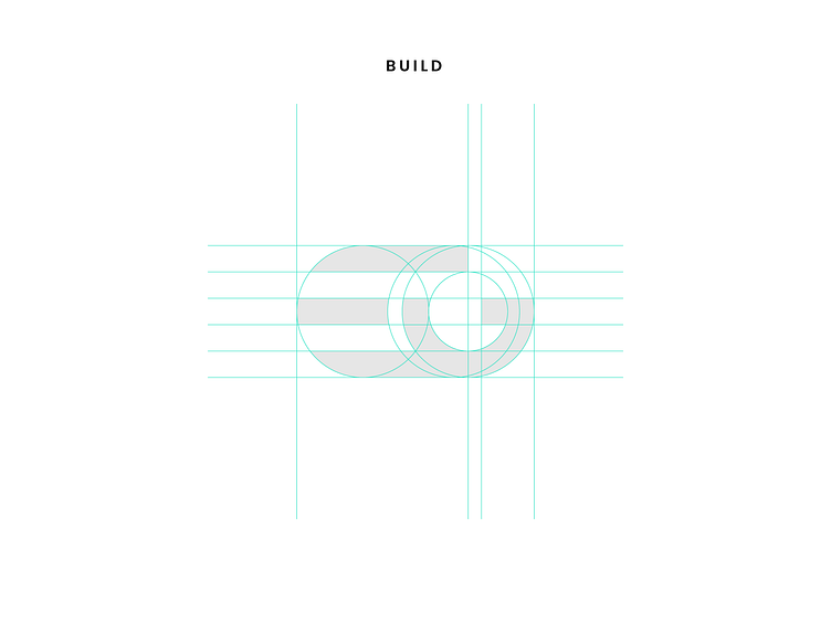
In order to gain and maintain a strong position in the industry, the brand needs to keep up with the fast-advancing technologies that are constantly optimising the processes. This dynamism inspired our concept: the lines suggest a forward motion, the sharp edges and the perfect cuts enforce precision and focus. The negative space gives the symbol more character, forming the letters E and G with a hint of playfulness.