Brandng – True Peaks

True Peaks – The Second Brand:
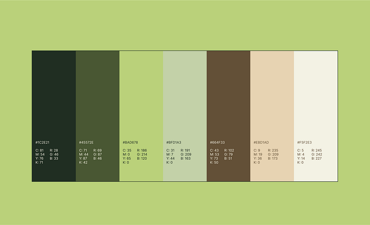
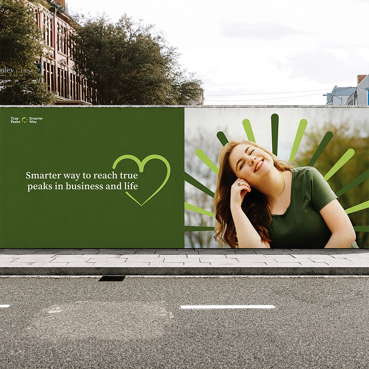
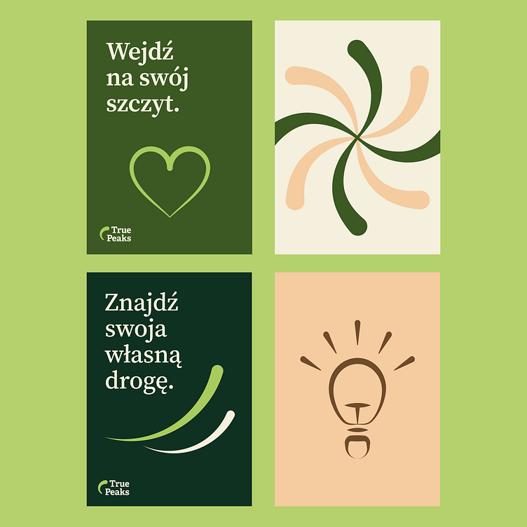
For True Peaks, the idea centered around soft, dynamic shapes in soothing green and vague colors. Green signifies growth and personal development, reflecting the journey of self-discovery and reaching one's true peaks. The blend of gentle, fluid shapes suggests a nurturing and supportive environment, perfectly suited for True Peaks' predominantly female clientele seeking personal and professional growth.
In both cases, the color choices and design elements were meticulously crafted to encapsulate the essence of each brand, delivering a visual identity that resonates deeply with the target audience.
Animation ❋ Brand Identity ❋ Print Design ❋ Social Media