Sweat Hero: Onboarding Missions 2024


Hi-diddly-ho there neighborinos! 👋
I'm John a senior product designer on the Sweat Wallet team.
I was recently tasked with designing a mission based onboarding system for Sweat Hero: Sweat Wallet's quick tap reaction game.

So what's the brief?
The brief was to design a new approach onboarding users, as the current onboarding was not converting.
The missions system concept is based on using existing patterns within the app that users will find more familiar and accessible combined with super cool graphics and financial rewards.
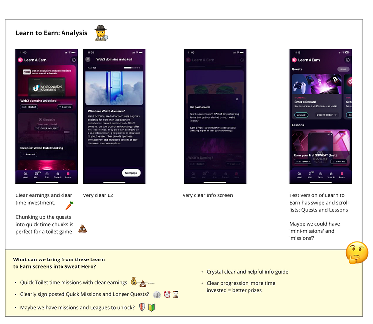
Research 🕵️♂️
I wanted to take some existing patterns from Sweat Wallet's successful 'Lean to Earn' feature so I started the research with an analysis.
Another early idea I had was to introduce a 'Start' screen inspired by classic arcade user interfaces. Where the user could choose between a free play Arcade mode or an 'on rails' mission based story system.

I created some quick early concepts as a collage in Miro to try and create the look and feel I wanted for the mission system.
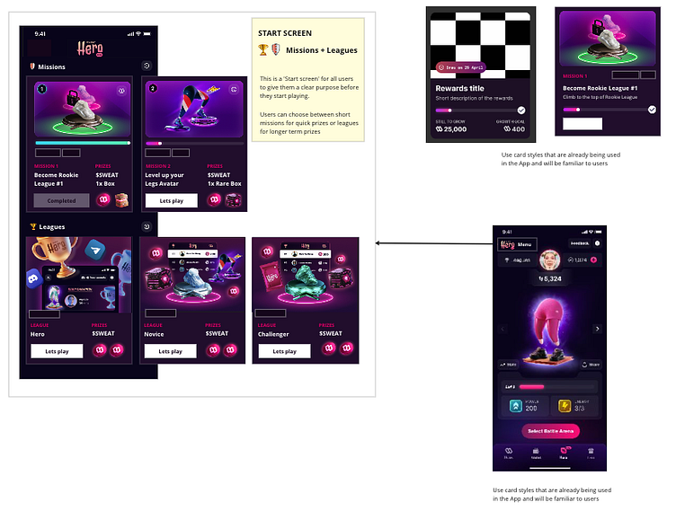
After presenting this to the team a new direction was discovered. We decided to divide the Onboarding flow into 2 halves.
Below in the flow map you can see how the onboarding is in 2 halves.
First Half = Mission 1 + Mission 2
Second Half = Home Tooltips
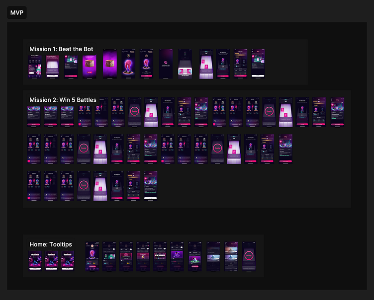
The first half was 2 tutorial missions to introduce users to gameplay and reward them after each mission to keep them motivated.
The second half was to the introduce the full game, unlocked by completing the first 2 missions.
By chunking up the onboarding in this way and giving clearer smaller objectives we hypothesised this would be less overwhelming for users and would keep them more motivated and engaged.
1st Half: Mission 1 - Screen design
I needed to design a new screen for missions. I wanted it to feel familiar so I took inspiration, patterns and existing components from the Learn to Earn feature.

1st Half: Mission 1 - states
The new mission screen needed multiple states as the user progresses through the mission. The button also needed to be multi purpose, below are the 2 states, the gameplay between the 2 states acts as the transition.
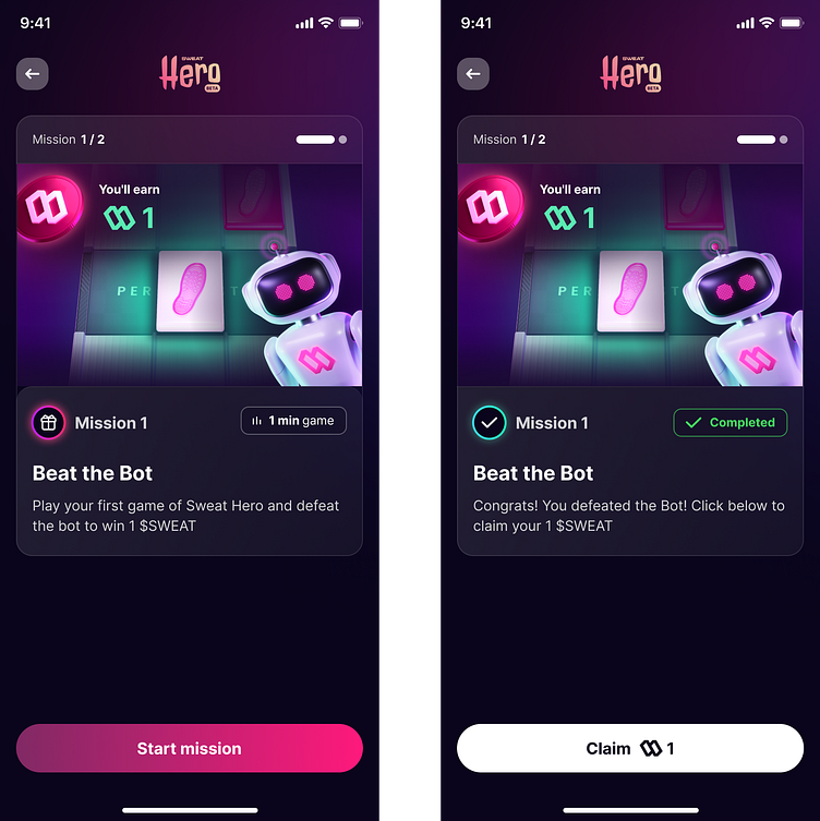
To offer a dopamine hit to encourage further motivation, I added a confetti animation and flashing claim button rewarding the user for completing the first mission.
1st half: Mission 2 - Screen Designs
For the 2nd mission I built on top of the pattern that I had created for Mission 1 and added a new component as Mission 2 required the user to win 5 Battles to complete the mission.
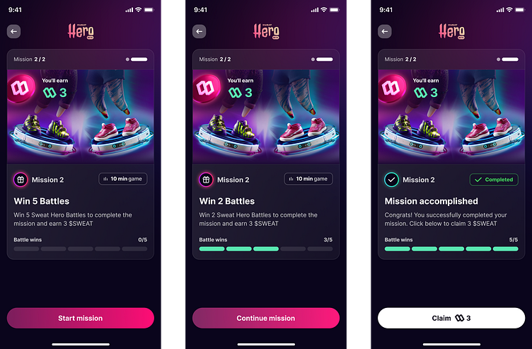
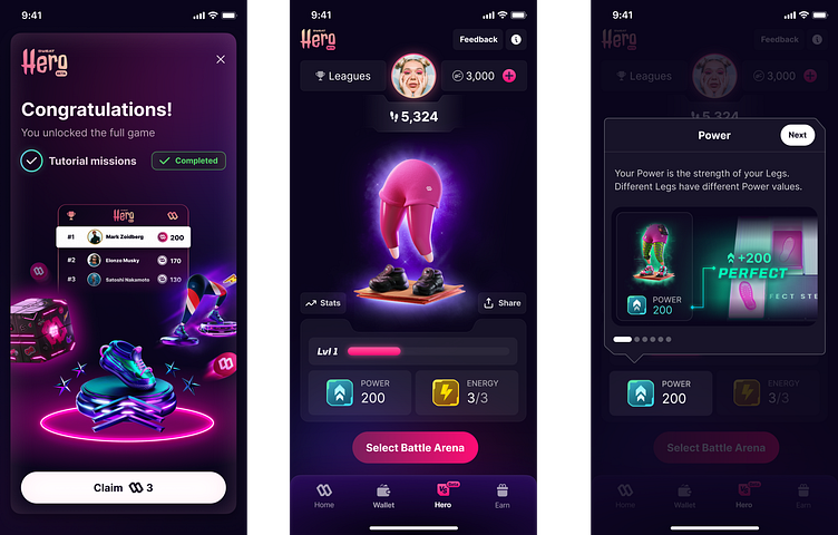
I reused the confetti and flashing claim buttons when the user completes Mission 2, and designed a new 'story' screen congratulating the user for completing the tutorial missions.
For this story screen I used some graphics that tease new features that the user can now experience in the full game.
2nd Half: Introducing The Full Game
I wanted to use a different way of introducing the full game to users so it felt like a larger and more open experience.
To do this I created some Tooltips with illustrative graphics to quickly communicate the new features and guide the user around their new Homescreen which will now be their main touchpoint.
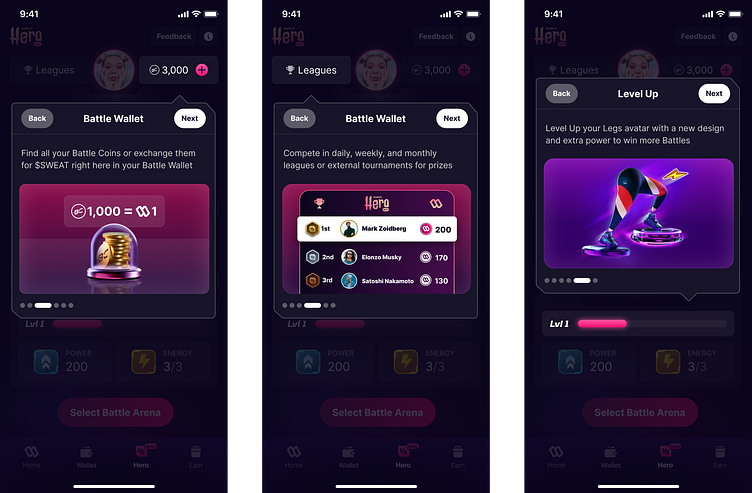
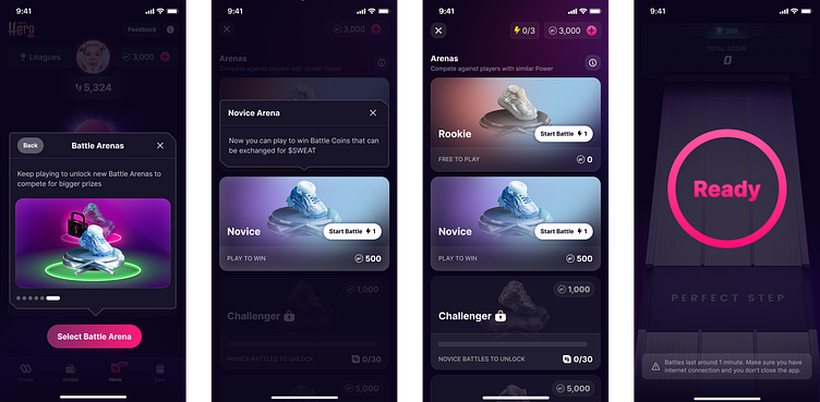
The 2nd half of the onboarding flow guides the user through the new features on the homescreen and into Gameplay completing their onboarding journey.
Thank you for reading, what are your thoughts? Let us know in the comment section! Press "L" on your keyboard to show us some love ❤️
Sweat Wallet is available on App Store and Google Play


