EB icon

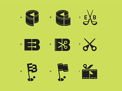

I was approached by a FX Networks film editor (working on Devs at the time) to design a logo for his side project – combining his day job in the ‘editing business’ with his love of golf.
There was plenty of film (yes I know, old format) and golf iconography to work with and it was such fun to work on that I also developed the unused sketches. Colour was not required as it will be embossed on a golf marker.
Which one do you prefer or think is the best visual metaphor?


