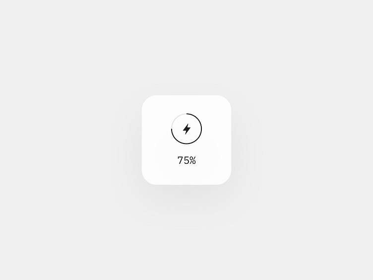
Battery Charge Widget


Usually, when we want to display progress-like information in a limited space like a widget, the first thing that comes to mind is to use a ring. Especially taking into account that the space efficiency of a ring is 3.14159265359 times more than a bar.
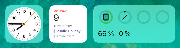
Recently, I noticed that Apple uses rings in the battery charge widget to show me how much energy is left amongst my devices. They also show a percentage of remaining energy to be more specific about it.
At first glance, it seems like there is nothing wrong with the widget, and it works well. But I was wondering if there is something that could be improved.
Visual clearance
The first thing that you see, as a Designer, looking at the widget is a little bit of busyness caused by the inconsistent weight of the icons and the thickness of the rings. In addition, they are just too close to each other, which complicates the shape recognition and differentiation of the signs.
(The zero thing is low contrast between the default background (sic!) and the green rings. It makes the UI elements hard to read. But thanks to the numbers, we're able to get what's happening.)
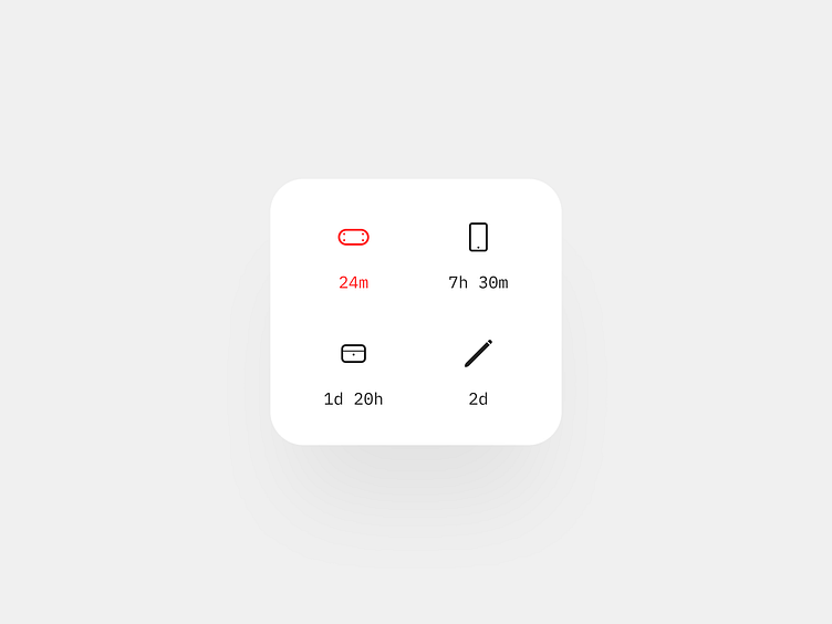
The simplest possible solution here is to get rid of the rings.
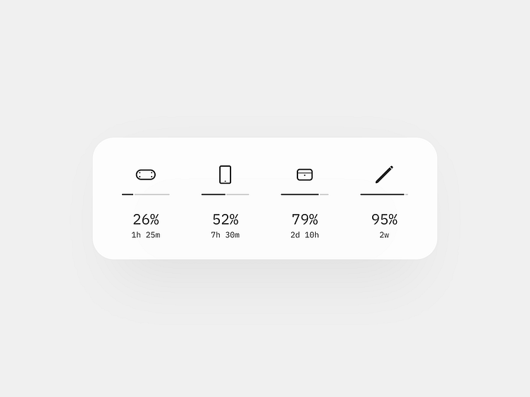
Yes, it's a bar. Looks like the efficiency of the UI dropped by PI. But did it?
Let's take a look at what happened:
— The icons and the bars have the same stroke weight, which makes the whole look more consistent;
— They are on different levels in the visual hierarchy, which makes the overall hierarchy stronger and the readability of the UI elements legible;
— The labels with the time estimation information tell you how much time devices will last until they shut down;
— Color coding is reserved for critical situations (which we'll discuss further) when we really need a user to pay attention. We don't color normal cases. We don't want redundant meanings in our interfaces. No Peter and wolves situations.
Device snippets order
From a Product Design perspective, the hardest challenge in designing the widget is how to arrange the device snippets sequence.
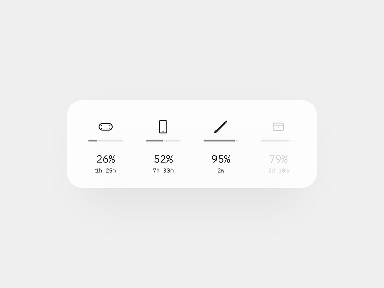
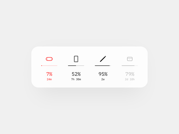
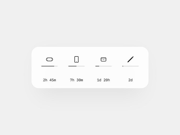
It might seem that the answer is on the surface. It's a no-brainer case: we should arrange the device sequence in turns of percentage. And we would have the ascending order like this:
But the percentage order misleads. The energy charge for the pencil is the last thing we want to care about. Especially considering how easy and fast we can charge it. As you can see, the device which is the closest to being run out of battery is an XR headset.
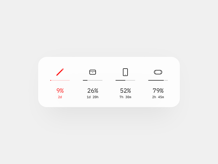
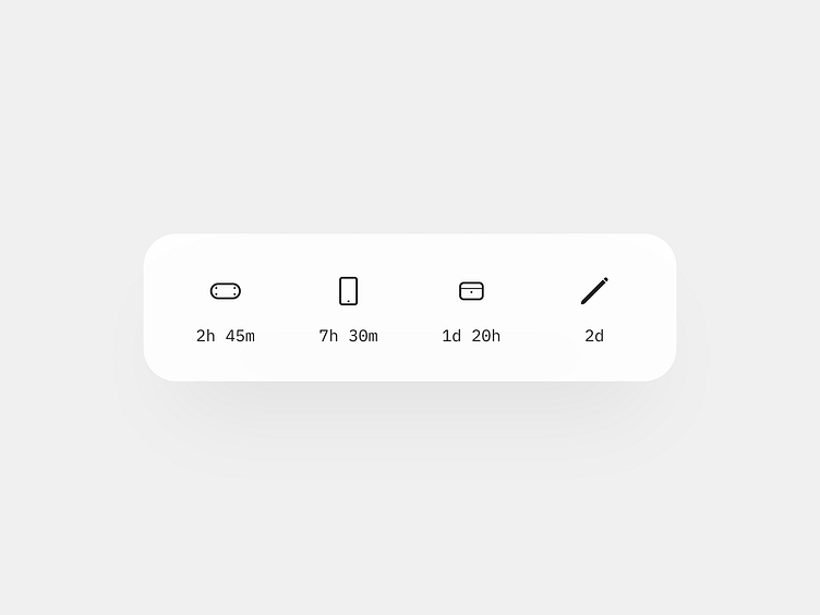
The percentage-based range creates a false sense of the situation. Let's try to arrange devices based on the estimation time.
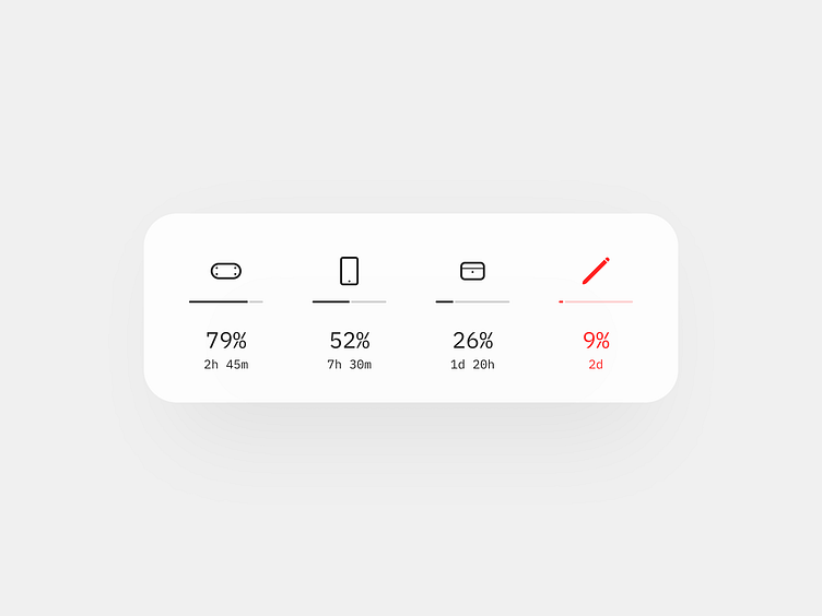
Now, it looks like the order is correct in terms of the plug-to-charge-it priority, but we have a couple of problems:
1. Percentage label visually dominates in the hierarchy, which makes it look like the snippets arrangement is arbitrary;
2. Color coding misleads and also enhances the sense that there is nothing thoughtful in the order.
(Interestingly, how often by fixing one problem yield another one.)
So, let's try to fix the issues.
Heuristics for color coding and estimation precision
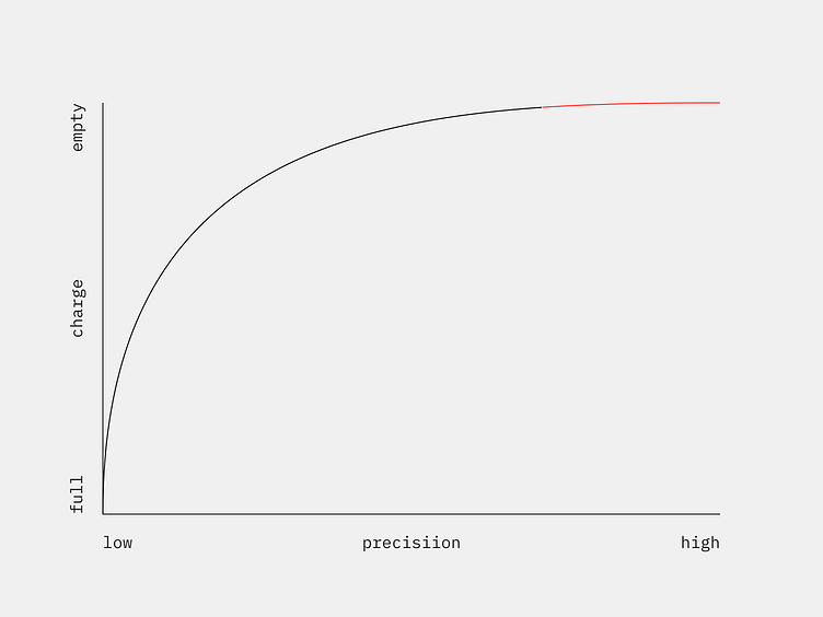
As we have seen, the color coding doesn't work in the way we expect. Even if the pencil has only 9% percent left, it's not something I want to be troubled with (days are more than enough). Does it mean that color coding is useless? No, but we use heuristics, which means we need to adjust color coding principles to each device's energy consumption context individually based on empiric observations.
For example, here is a graph that shows a linear relationship between color coding, estimation precision, and the charge level.
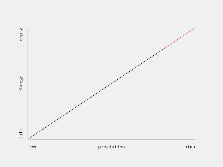
But for the pencil, we would like something like this, since it would last quite a long even with a low amount of energy.
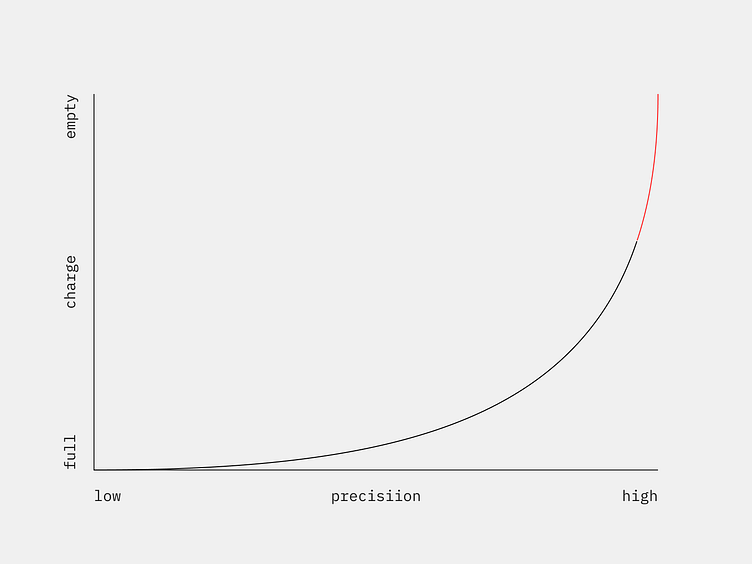
And on the contrary, our XR headset is likely to shut down soon with 10% of battery since it consumes more energy when it's rendering high-quality video with at least 90 fps for both eyes... so we definitely want to keep track on how much time is left and how long it will last.
What problem the widget is trying to solve
The thing is, this type of question we always should ask first before we start designing. In our case, the problem is to show a user how much time the device will last until it shuts down.
Do we need to show the percentage data?
As it was shown above, the data is inconsistent and misleading. 50% of battery charge for a pencil, which can last a week, is not the same as 50% for an XR headset which will last only a couple of hours.
So, let's get rid of it.
The same we can do with the indicators since their function is practically the same.
Now we have the only information we need. Icons identify a type of device, and the text labels with the estimation time show us how much the device will last until it shuts down.
Of course, the charge time estimation heavily depends on the device's consumption context. We can quite accurately estimate the lasting time for a pencil because its consumption context is consistent. In opposite, depending on the program you use, the energy consumption of your iPad can differ. One thing you read a book, other you play a video game. Obviously, you will run out of battery faster in the last case. But since all the devices are personal, we have all data we need to recognize use case patterns and train our estimation algorithms to make our predictions reliable.


