Introducing IO


Most of my time at Mercury has gone towards this product, and I'm so stoked to share it with y'all.
IO is our first credit rewards card—it's a charge card, backed by the balances held in Mercury accounts, with simple cashback (1.5%), straightforward repayment (no weirdness, you pick your payment date), metal cards for founders, and all the normal benefits of Mercury (unlimited virtual cards, a great mobile app).
I'm going to try something different with this series. Over the next few weeks, I'll be sharing breakdowns that go beyond the screens, into the product thinking behind the work. There'll still be little design details and visual candy, but hopefully something more substantially useful as well.
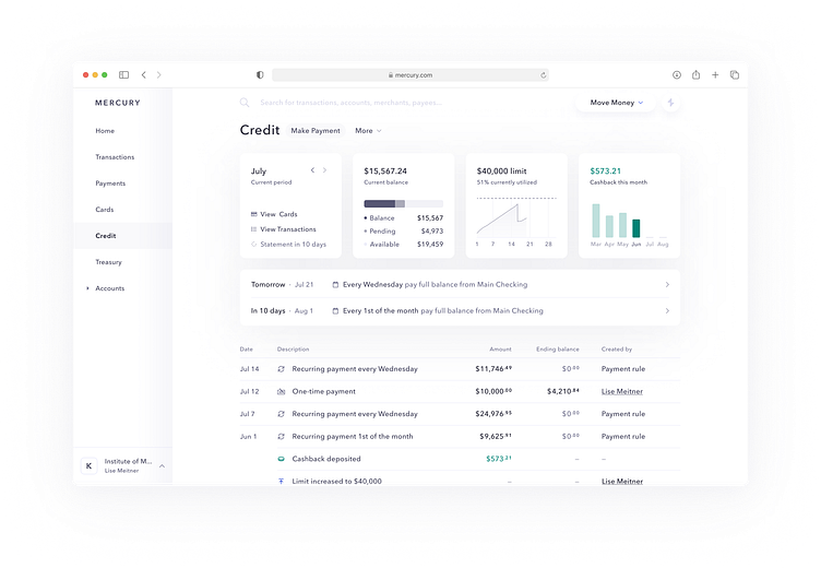
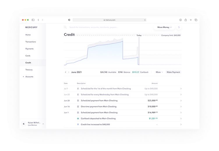
The page is broken down into a few key areas:
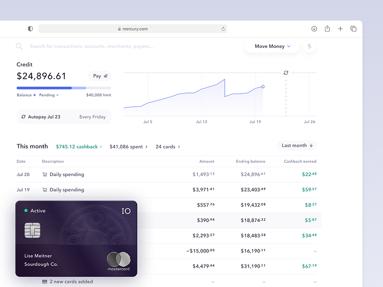
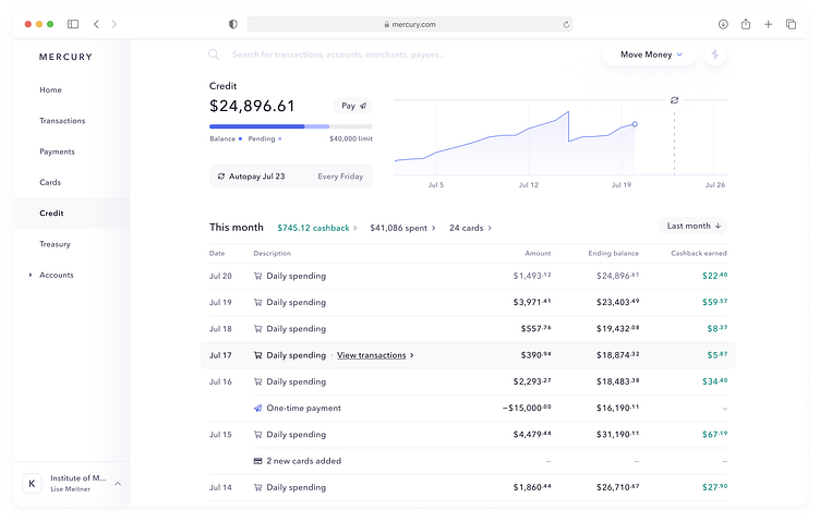
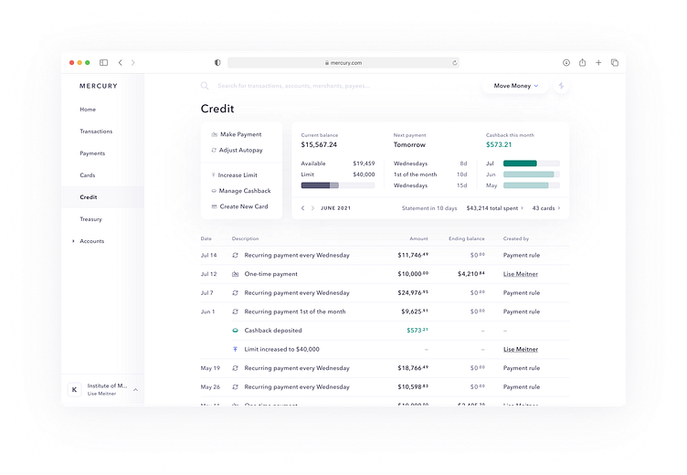
Summary. Current balance, limit information, next autopay, and some key controls around payments
Utilization Graph. Historical credit utilization, with a marker for the next automatic payment.
Activity Log. A list of a ton of account-related events, from daily spending, to payments, statements, limit changes, and more.
For this post, we're going to dive into the summary section, and get a glimpse of some of the many page-level iterations between project start and the shot above. I'll cover the Activity Log and Utilization Graph in separate posts (subscribe? ;-)
How we got here
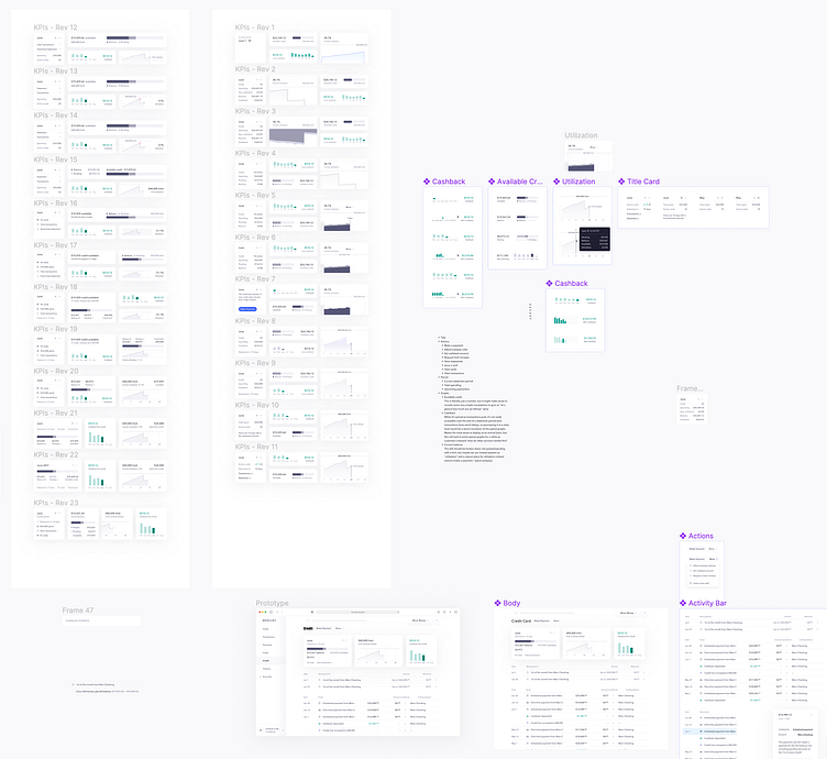
With such a critical page, we went through a ton of iterations. One of the biggest challenges early on (beyond figuring out what customers were actually interested in seeing on this page) was where the account information should live.
We flipped back and forth between two main options:
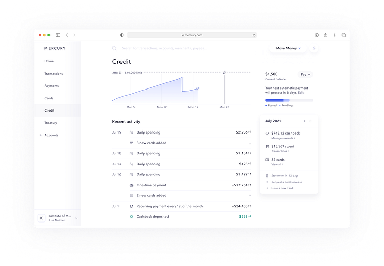
A dedicated page. This mirrored our checking accounts more closely, and left ample room for other "weird" account types. This option also gave us a lot more room to play with.
The Cards page. Often when folks thought about a "credit card," they leaned towards a consumer-oriented model—you have a single card that you spend from, and the "account" is the card.
For corporate card programs, we knew flexibility and scalability was going to be important, and found the second model to be a little too constraining. For one, the cards page ended up pretty packed:
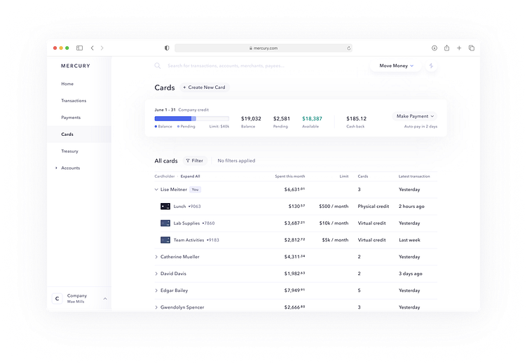
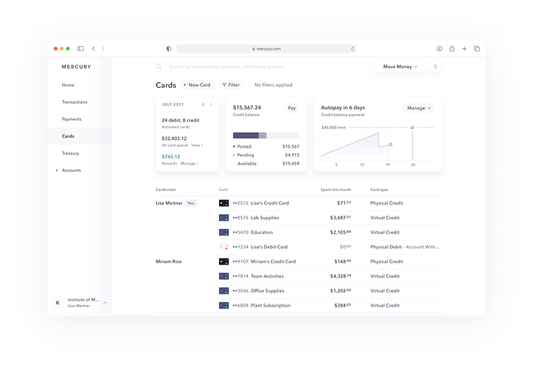
These approaches tended to push cards content down, restricting the amount of actual cards we could show at once. It also didn't leave much room for things like logs, rewards summaries, or rich utilization graphs—trying to pull those in tended to overcomplicate the screen.
Other explorations of the dedicated "account-style" page also suffered from some of that over-complication as well:
To be real for a minute, if you're looking at this and thinking "damn, that's a lot of iterations" you're not alone. 😅
Most of my background has been at fairly small companies (some less than 10!), and I struggled to manage stakeholders and feedback in the larger, growing environment. Mercury has been a really interesting place to do this specific kind of growth (I'm a lot better at iterating now, I promise) because of our focus on Quality.
At previous roles, there's sometimes been an attitude of "what can we cut" or "looks good, let's ship it." At Mercury, not only will you get feedback from colleagues (we have a great pushback culture), but also from involved leadership. That pushback helped to identify a lot of low-quality directions and explorations from those earlier shots, but also meant that we ended up cycling through more ideas.
Now having the benefit of hindsight and growth, we could have avoided more of those iterations with more work spent up front: gathering requirements, workshopping them with stakeholders, then finding agreement on context and goals. While we did extensive research about which customers might use this interface and what they'd want from it, I (classically) jumped too quickly into visual explorations, which led to a lot of low-quality paths.
While I can't share more of those past iterations, you can play with the live version on our demo site (demo.mercury.com/credit), or come help us design new experiences (we're hiring senior product designers).
From legal: The IO Card is issued by Patriot Bank, Member FDIC, pursuant to a license from MasterCard ;-)


