hello hotdogs Logo & Brand Design


Hello Everyone!
Last year I worked on a project for a local fast-food related business, named hello hotdogs. I wasn't able to share the result, but now I would like to do it.
I started off with the logo, which is type based and has been modified in such way so the three letters resemble a hotdog symbol. Do you see it?
All of the letters that make the wordmark literally come together to form a community of hotdog lovers.
Also did some work for the brand identity part having the logo as a starting point.

Brand Typography
The backbone of any visual identity is Typography.
Depending on the selection of type, a mood can be set that can spread across all platforms and help set the tone of voice of the brand.
I went here with a rounded and friendly typeface Nunito that was also the foundation for the wordmark.

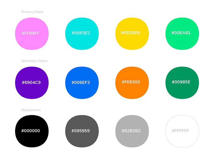
Brand Colors
For the colors I wanted to go with something that says diversity, community and groups of people that all share the same common love for hotdogs.
Brand Messaging
By combining color and type a message can be conveyed in a certain way. Not just in any way but in a personalised and with a custom approach that addresses the target audience.

App Icon
When simplified, the helllo wordmark leads to a simple app icon that resembles a hotdog.
Your beloved hotdogs are a few finger taps away.

Brand Website
By combining the Brand Colors & Typography with Graphic Elements you get a branded message. I've compiled everything and placed it into the hero image of the website.


Projects 📩
mihaidolganiuc@gmail.com
Let's Connect 👋
All images, artworks in this post are not to be used or distributed without the consent of the designer.
© Mihai Dolganiuc Design 2022. All rights reserved.


