Surya Brand Guideline


Overview
In the realm of health and fitness, Surya emerges as a cutting-edge health tracking application designed to empower individuals in their wellness journey. The app seamlessly integrates advanced technology with user-centric design, providing a comprehensive platform for users to monitor and enhance their health and fitness levels. The name "Surya," derived from the Sanskrit word for sun, symbolizes energy, vitality, and the illumination of one's path to a healthier lifestyle.
Approach
Research
Before delving into the design process, a thorough research phase was conducted to understand the target audience, market trends, and competitors. Surveys, interviews, and user feedback were collected to grasp the diverse needs and preferences of potential users. This phase helped in identifying key features and functionalities that would set Surya apart in the competitive health tracking app landscape.
Logo Concept
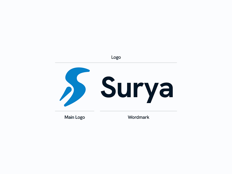
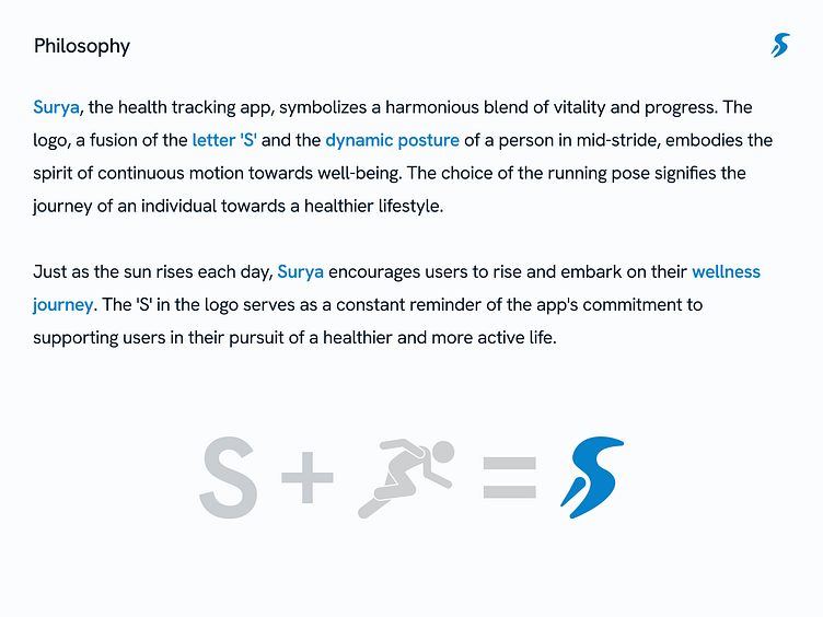
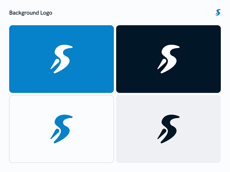
Surya Health Tracking App's logo is a testament to the careful consideration given to both research insights and creative design. By blending the symbolic 'S' with the invigorating pose of a runner, the logo captures the spirit of the app, inspiring users on their journey to holistic well-being. This case study showcases the meticulous approach taken to create a brand identity that not only reflects the app's functionality but also resonates with the aspirations of its users. Surya stands as a beacon, guiding individuals towards a healthier and more active life.
Brand Guideline


Brand Implementation