RE5.5 - cosmetics brand

Logotype | Identity | Packaging design
Cosmetics brand | RE5.5
Company
RE5.5 is a company with a focus solely on the delicate art of eye care, that stood out as a beacon of innovation and excellence. RE5.5's philosophy was simple yet profound: to empower individuals to embrace their natural beauty with confidence and grace.
Logotype
The logo design is a striking embodiment of simplicity and minimalism, seamlessly fusing two integral components: the letters «RE» and the numerical figure «5.5». This clever combination not only creates a visually engaging and unique symbol but also carries a deeper message about the brand's identity and values.The choice of a clean and uncluttered design conveys a sense of modernity and efficiency. This simplicity not only makes the logo memorable but also versatile, ensuring that it will work effectively across various applications, from digital platforms to physical merchandise.
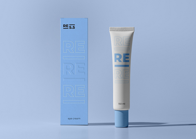
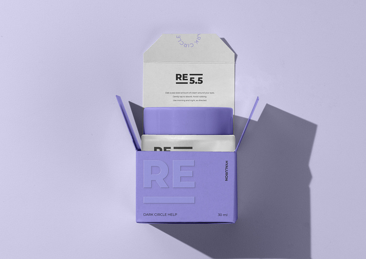
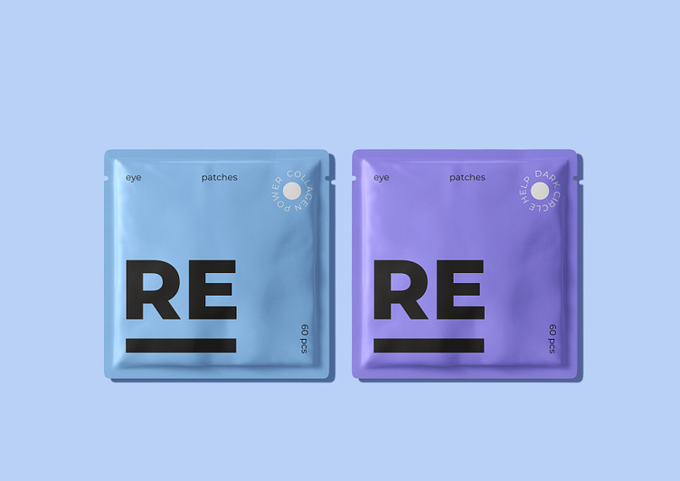
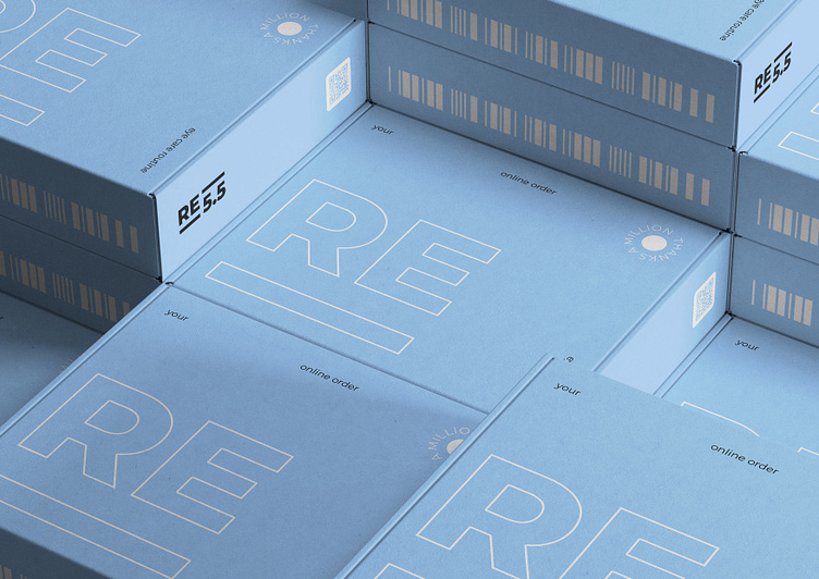
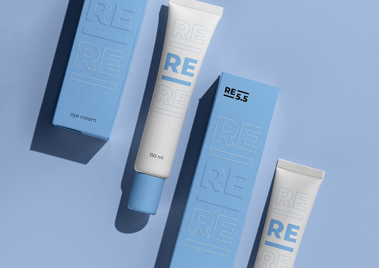
Packaging
The design process for the packaging of RE5.5's eye care products was a meticulous endeavor, guided by a commitment to excellence and a dedication to embodying the brand's values of elegance and innovation.
As a result, the packaging design for RE5.5's eye care products is a harmonious blend of form and function, beauty, and practicality. It not only reflects the essence of the brand but also serves as a powerful tool for engaging consumers and leaving a lasting impression. With its sleek appearance, sustainable materials, and attention-grabbing effects, the packaging is a testament to RE5.5's unwavering commitment to quality, creativity, and innovation in the world of beauty.