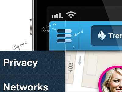
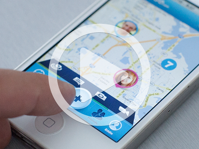
Here's a thought for the side menu animation. This isn't a final piece so any feedback or ideas are definitely appreciated.
I threw together a short little preview Play it!
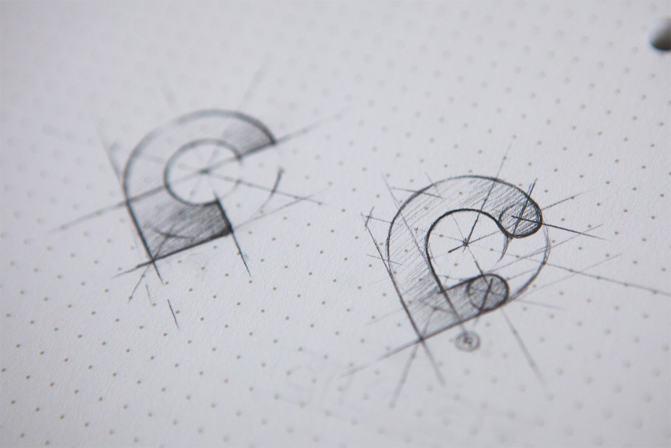
Also check higher res photo or pixels attachment for more deta...
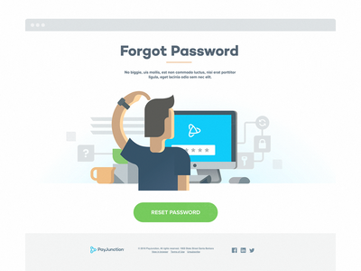
Hey guys,
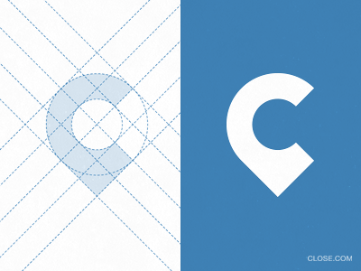
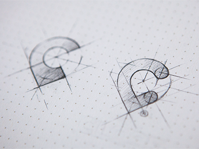
Designing a logo mark for Close. Basic idea here is a C-shaped map pin.
Would love to hear some votes on which one you think looks better. A-left or B-right. Thanks! :)
little interaction idea just came to me for top bar button states...
basically when you swipe or tap side menu button, it would come in pushing the button fill color light to dark, depending on side menu right edge position.
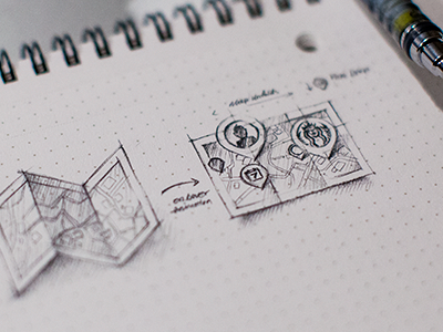
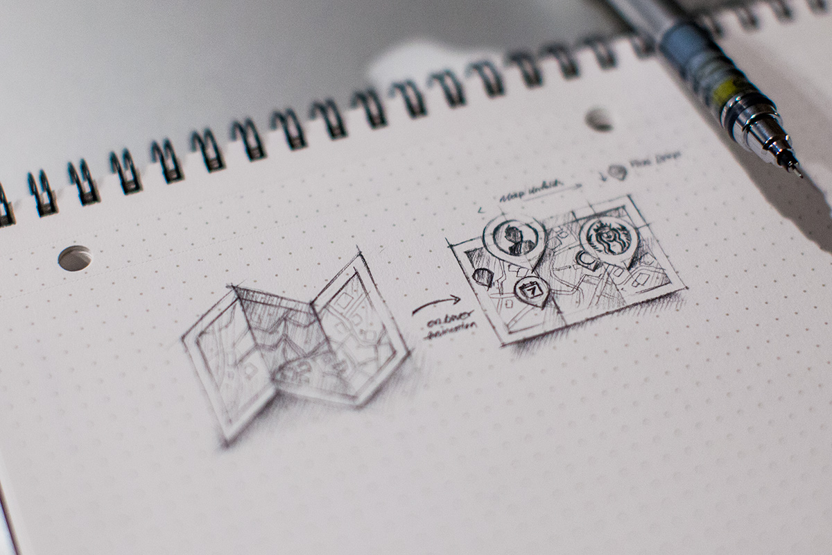
Hey guys, I just thought of an idea for icon on hover animation for close.com site. App and website are in the process of being built. Anyway here it is, on hover:
1. Half way folder map quickly unfolds.
2. Pins randomly fade in and dr...
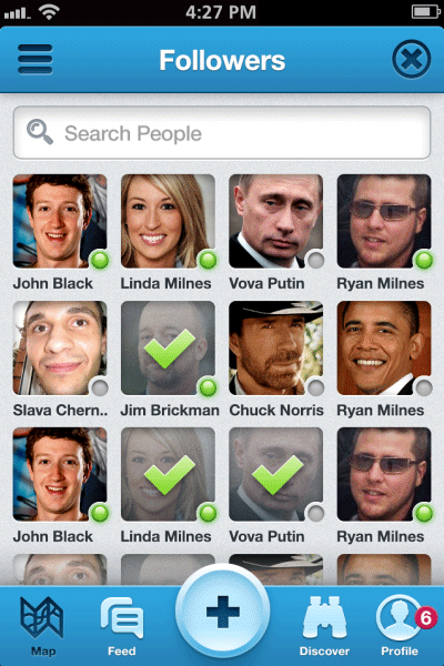
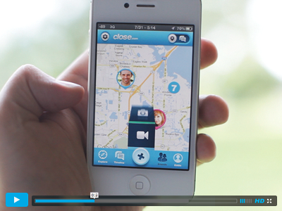
Another thought for Close nav animation. Let me know what you guys think... which one do you like better?
https://vimeo.com/46716470
Note: The animations on the screen are shown at half speed to show more details.
follow on twitter
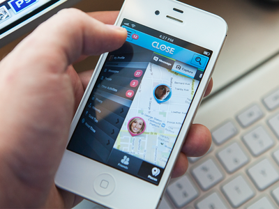
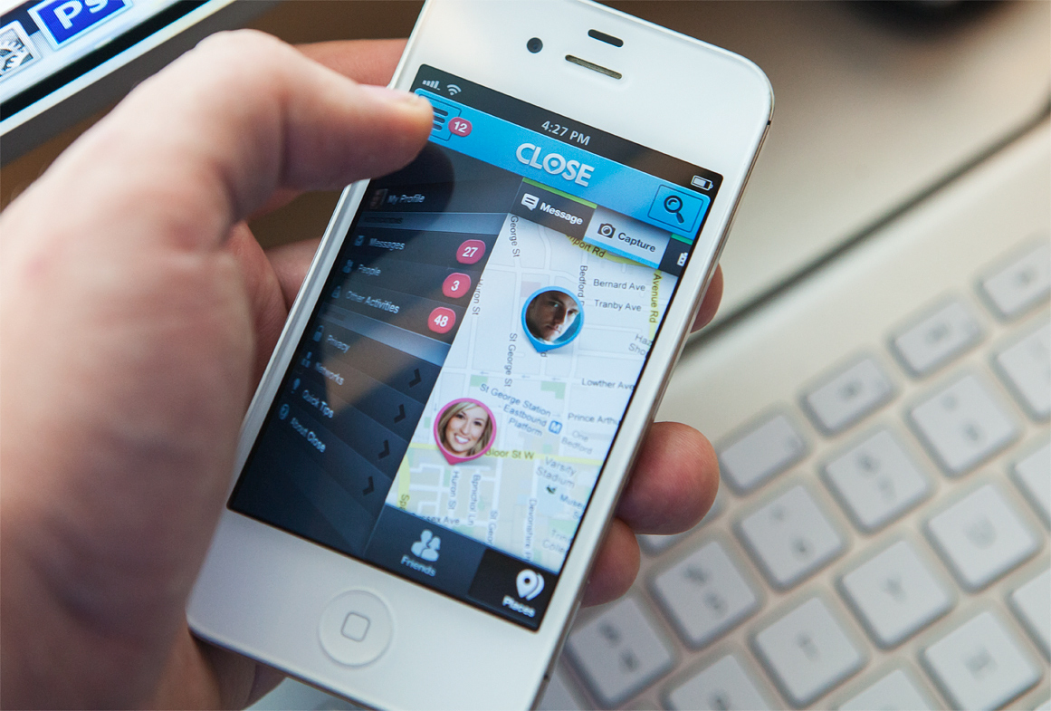
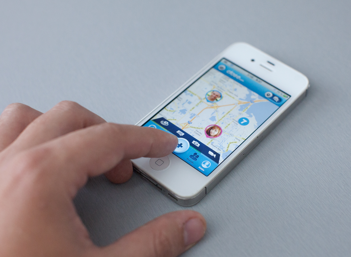
Working on super exciting social discovery app close.com , thinking of different nav ideas, here's one of them...
what do you guys think?
https://vimeo.com/46506589
*Larger photo attached, pixels soon to come.