👀 BIG news from Dribbble...
10 Shots • 3 Attachments
August 16, 2012
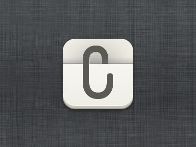
What do you think about a version without any colors? Oh and btw: It's supposed to be a clip and at the same time be readable as the letter "C".
I'm working on the icon for a new project of my own right now. I want it to be very simple on the one hand, but don't want it to look too "boring" on the other hand. So I'm wondering: Which version would you prefer (and why?)?