Yova Brand Guidelines


Creating a brand system for Yova was a challenge through and through; starting with logo shapes and colors, all the way to the visual content that would become an integral part of their reputation in the digital space. Perhaps even outer space, but don’t quote me on that.
We led the process of defining the entirety of the brand system as a joint effort with the Yova team and key stakeholders. We accomplished this through intensive remote workshops and a comprehensive art direction process, where we defined key stylistic principles for our friends over on the photography slice of the spectrum – the creative one.
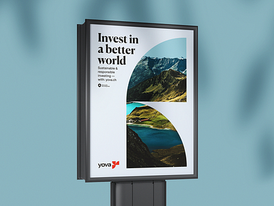
The unique approach that we came up with formed the foundation for the entire rebrand, enabling us to create a system of multiple visual subcategories that appeal to the target groups – each in their own way. That’s how we locked down the few photography categories that are present throughout Yova’s entire brand identity (props, nature, and people).
The crucial brand elements that we’ve defined promote playing around with the base elements of Yova’s logotype, thus bringing the underlying logo story full circle, in distinctive style.
The entire design system truly comes into its own on in proper context, so stay tuned to see what it’s all about when we unveil the design of Yova’s website and other brand assets.
See full guidelines in the attachment.
—
Team/Credits:
Art direction: Petar Stojakovic
Branding: Marko Ivanovic
Web design: Petar Stojakovic
Motion: Nebojsa Jurcic
Writer: Lex Molnar
—