Bench Clearers Secondary Marks and Spot Illustrations


Hockey! The lip lettuce. The silky flow. The chiclets lost to protect the biscuit. Chirping hosers while they head to the sin bin. It's a game like no other. With a culture and language all its own. That's why we were stoked when our friends at Bench Clearers approached us to help them expand their brand identity with illustrations, alternate marks and badges, swag, and a design toolbox of assets to mix and match as needed on web and social. Bench Clearers make all-season hockey fits, so you can bask in team loyalty year-round. They're officially licensed by the NHL, and officially comfortable as all get out. No more do you have to sweat it out in your hockey sweater, or settle for a plain t-shirt in the off-season.
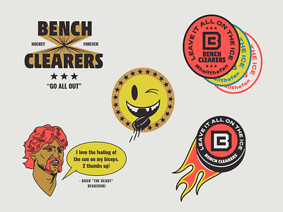
Bench Clearers' epic logo (peep that B icon in the middle of the flaming puck) was done by the talented Titus Smith (senior design at espn). Other than that, we had an open rink to dream up the design mood for supporting assets. We found huge inspiration in old issues of Hockey Illustrated from the 70s. The vivid, primary color schemes. The no-frills condensed sans serif fonts set in neon yellow. Here's a good smattering of the badges, secondary marks and illustrations we developed.
In the lower right hand is one of the Bench Clearers characters, Buck "the Beaut" Beaujuski. Image 2 features other characters we developed to help communicate selling points. Image 3 shows portraits of the founders: two stand up dudes who love them some hockey. We've known one of the founders since high school! Greenwood High School Alum success stories.
Link here to browse the Bench Clearers shop: https://benchclearers.com/


