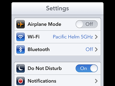
Settings Redresign Preview


I was slightly obsessed with @Mantia's iOS 7 Settings shot, Even though I am a massive fan of Avenir - Sometimes Helvetica just is the vanilla-flavour iOS needs. So, I went lighter. It's classic Helvetica but with a 'light and airy' twist. It might look garish at first but stare at it - stare at it on your Phone too. It starts to breathe life into the space around the lettering - it feels fresh and open.
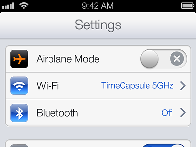
Im a huge fan of skeuomorphism too. I love texture, it has character and life. It's smooth and honest. Not robotic and disjointed or detached like a lot of 'flat' design of late. Although I don't discredit it for it's style or originality. Call me old-fashioned, but a drop shadow or a gradient can work magic if done tastefully - that's the key to all of this - it's all about taste. And everyone with access to a faux-leather texture was going nuts with it!
So, here's my rebound.