Green Pin - Brand Design

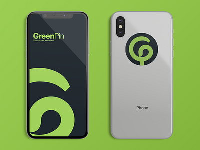


First look at the foundations of GreenPin's brand identity.
In short, this conceptual progressive web app provides alternatives to meat, along with where to buy and how to cook them, with the vision of helping reduce global carbon footprint by affecting people's lifestyles.
Given the context here, we need something that reflects:
→ Empowerment, the idea of teaching, because we give people the tool to make better choices, for themselves and the planet.
→ Transparency, as it will be a platform driven by its community, where people give direct feedback on products or places.
→ Sustainability, for obvious reasons
→ Inclusiveness, since we have to change habits on a global level.
In this case, I also wanted to explore solutions that minimize the design impact. For example, when picking colors, I paid attention to the overall ink consumption. Sometimes the difference between two colors is almost unperceivable, yet if you tweak it right you can make a pretty big scale economy.
A concrete example is the Black used in the identity. For the same Hex Value, you can either have a CMYK value of (respectively) 82, 69, 60, 75, when you can obtain the same color with 20, 0, 0, 100. Try it out, you'll see! Unless I missed anything, this simple trick saves 186% of the ink you'd use with the color picker. 🤯
Finally, to tie better the icon and the typography, I modified the G to make it less rigid and giving a more organic feel to the overall.
Thanks for reading so far. Feel free to let me know your thoughts!
Have a good one


