Weekly Warmup California License Plate


Context
I took up the Dribbble Weekly Warmup Challenge to design a license/registration plate for a vehicle. I picked California.
Design Process
I came up with 3 design concepts and posted them on my Instagram Stories to crowdsource feedback.
Two themes of feedback emerged:
1. Legibility
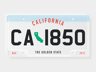
I stripped down everything and focus on the typography. The letter should be easy to read and quick to be glanced, especially in the case of accidents and crime happening. I picked ‘Charles Wright’ number plate typeface, which is similar to Square Euro-type version, as mentioned by Vinod Nair in his article “A Standardised Number Plate Typeface For Malaysia”. Definitely check out an in-depth study written by Vinod Noir on KreatifBeats. I am fascinated by the research and case study that went into this: https://kreatifbeats.com/2018/08/01/a-standardized-number-plate-typeface-for-malaysia-proposal/
2. Adding decorative elements and colours to reduce white space
California is world-famous for its beaches and surfing. So I added the waves decorative element to complement the plain background. I made the word “California” text to look curvy like on a path too. Colored the state green and added the issued date and year.
Thanks to everyone for participating! I’m humbled by the high-quality feedback contribution with reasonings that makes sense, and this just proved my point that everyone is creative and can have an eye of design.
Press L to show some love. Your comments and feedback are welcomed and appreciated! :)
Follow me for more upcoming work!
Portfolio | Twitter | Instagram | LinkedIn


