Kansas State Flag Update

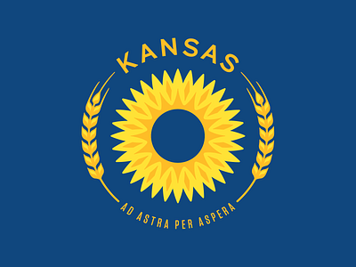


I grew up in Kansas and have always appreciated the heritage of the Wheat State – the sunsets, the big sky, even the wind. Kansas Day was on January 29th and I noticed the flag was a little overwhelming with information and needed a redesign.
After living in Colorado for a while – which has an awesome flag – I noticed that a state flag should be recognizable without the name of the state. And a state seal shouldn't be on the flag either as no one can see the details nor is a seal the defining character of a state. So I played around with some design options focused around the sunflower (the state flower) and the wheat industry. I think my favorite is the first one with KANSAS still included in the design. I honestly like the way the type looks emblazoned in gold on the blue background. However, I also wanted to see how the flag would look without "Kansas" so I designed a couple of options as well. It should be also noted that I really love the Kansas motto "Ad Astra Per Aspera" so I included it as well.


