Jelly Belly Logo Redesign

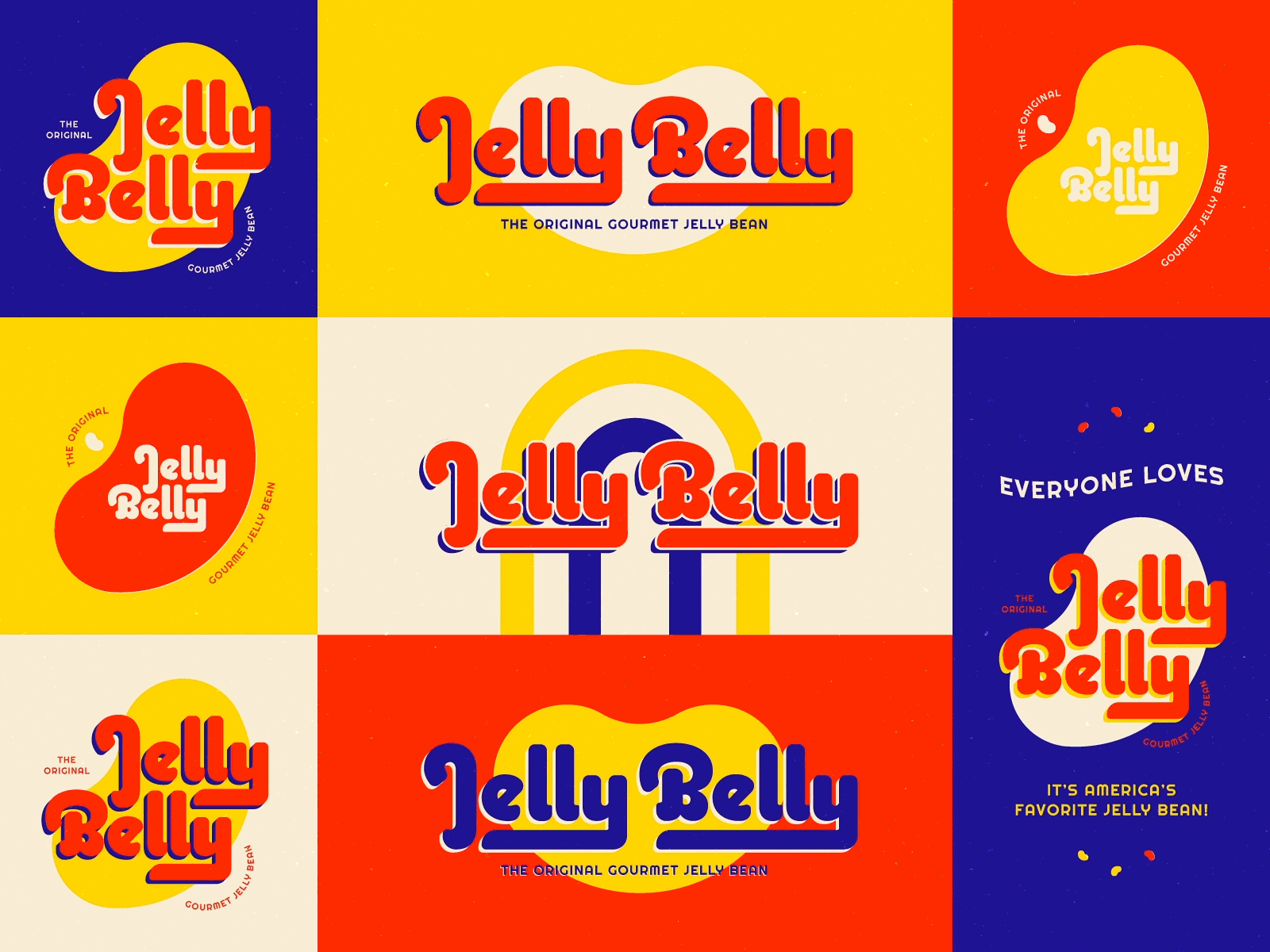
Tried my hand at redesigning an existing logo that could use a revamp. Jelly Belly is such a classic candy company, and (I thought) their logo could use an update to clean it up just a bit! I swapped the type to a more timeless version, and moved the jelly bean silhouette to the background to leave room for more variety in the application.
This exercise was SO much fun, I highly recommend trying it out on a logo that YOU think could use a revamp :)


