Cannabis Icons
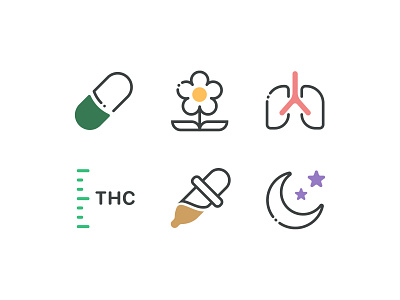
This updated icon direction surfaced for a few reasons. Early in exploration it was clear the previous set did not allow for the creation of more detailed visuals. The volume of color also started to take away from primary actions within the UI causing tension and unclear focus.
The suggested solve in this case is to scale back on the solid fills and use color sparingly to act as an aid in drawing users into aspects of the icons while also supporting a color targeted system that helped place each icon into a subject matter/theme bucket.
Fingers crossed this sticks.
branding
cannabis
cbd
flat
icon
illustration
lifestyle
light
line drawing
minimal
stroke
stroked
system
thc
vector
weed
View all tags
Posted on
Mar 3, 2020
More by Stephen W. Piercey View profile
Like


