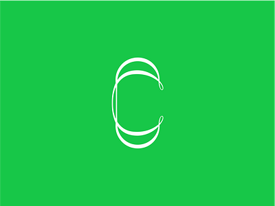
36 Days of Type, C
36 DOT, C.
Banged this one out before starting my work this morning, what started as two simple overlapping forms, ended up turning into an elegant yet modern contrast between thick and thin.
What do you think of this C? Would this be interesting as an entire typeface?
I think at the end of the 36 days I'm going to select one letter and create an entire typeface based around it!
Click "L" if you like it!
& leave feedback, it's always appreciated!
36days adobe
36 days of type
36daysoftype03
36daysoftype c
abstract
c
composition
concept
design
form
graphic
grid
illustration
illustrator
letter
modern serif
serif
type
typography
vectpr
View all tags
Posted on
Mar 4, 2020
More by Schriër View profile
Like


