Settings Screen Design

When working with enterprise products, there'll always be the need to add a settings page. What good is a software if the user cannot customize some aspects of it?
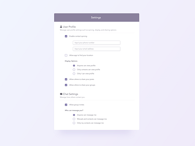
I made the novice mistake of mixing up checkboxes and radio buttons sometimes 😅, so let's take a look at some guidelines provided by the Nielsen Norman Group!
🔘 Radio buttons are used when there is a list of two or more options that are mutually exclusive and the user must select exactly one choice.
☑️Checkboxes are used when there are lists of options and the user may select any number of choices, including zero, one, or several.
Here are some things I keep in mind while designing a settings screens:
🟣Use text weight and sizes to define levels of hierarchy
🟣Make certain fields visible only when users want to enable the parent option
🟣Use indents to clarify levels of information
🟣Provide a short description for the section that users will be targeting
🟣Use a minimal, but obvious method to define the heading of a section from the content within that section
🟣Use spacing to help group information and making the page less cluttered
Happy Thursday everyone!


