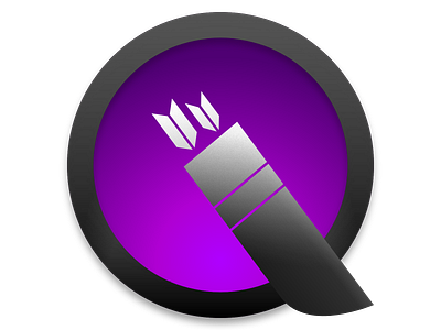
Idea for updated Quiver Icon
I never liked the small Q on the current Quiver app icon. The icon doesn't scale well. And why have a small Q, when the entire icon shape could become one? So I made this quick idea to see how it works.
The design is constrained by the concepts and ideas with the current app icon.
It wasn't inspired by Quicktime, but in retrospect I realised the similarities.
More by Johan Basberg View profile
Like


