Fat Fox Juice

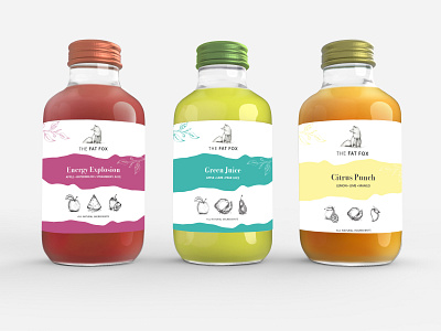
Here at Fat Fox, we found that our iconic illustrations were a distinctive element to our identity. So, when we wanted to rebrand, we aimed to keep these elements and give the brand a fresh update. We decided to add a little colour to our identity with a broken down colour palette of 4 colours. Our logo had a slight alteration as we felt it was necessary to move from the raial typeface above the fox to a horizontal title. With this came a slight alteration to the typefaces throughout the company.


