Take the Next Step Podcast–Dark Mode

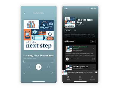

I created this dark UI mockup so I could see how strong the podcast cover design would be in a dark UI like Spotify's UI.
Being able to show the client the design in context help them see how the design would look and generated excitement about the design.
One thing I noticed when creating the Spotify-like mockup was the inconsistency in cover corners. Sometimes Spotify rounds the corners and other times the corners are straight. Do you think this is intentional? Does it add strength to the design of their UI?
Light mode mockup coming soon!