Sales Dashboard

We were working with a Sales Team and started exploring custom data visualization to tell an inspiring data story.
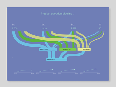
How does product adoption progress through different lifecycle stages. Sankey Graph type can help in visualizing how data flows from different regions starting from the pipeline.
Learn more about how we align KPIs with Business Outcomes in our week-long design sprint workshops - talk to us.


