Bold Seven

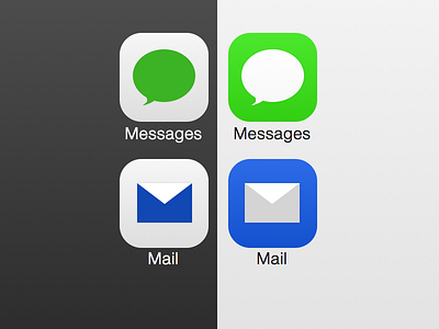
Not a fan of the iOS7 icons, so here's my first attempt at something I'd like.
Tried using bold enough colors, as most alternatives I've seen so far seem to go very muted/desaturated. Also, they're not completely flat—just a hint of curvature.
What side do you prefer, light tiles with color icons or color tiles with white icons?


