Aidai : Comparison Scatterplots for Reporting and Financial App


Hello Dribbblers! 👋
Aidai helps to create innovative and attractive business analysis and reports. It will give the average business owner insights on an easy way. The tool will gather his data from existing accountancy tools such as QuickBooks and Xero.
You can see the tool as a layer on top of the existing tools of the accountancy department to visualize the numbers and make it possible for the business owner to see where the business is heading to.
Last week i shared the cashflow screen and today i share you the screen which is a tool to create comparison scatterplots that will give great insights 🧑💻
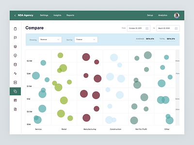
This tool allows to make comparative analysis of multiple entities on a single metric. By using this tool the user is able to compare and rank multiple companies and clients.
Each dot you see here represents a company. The position of the dot vertical represents the performance of the company relative to the peers. The position you see horizontal of the dot is the sorting of the all the companies. And last but not least the size of the dots is defined by the the metric which is selected as the comparison metric. In this screen we selected the revenue 🤓🤓
Hope you guys like it! 🙌
—
Delight us! Press “L”.
Want to see more projects? Visit our profile or our website and remember to follow us!


