Blurr Icon - Insight Needed


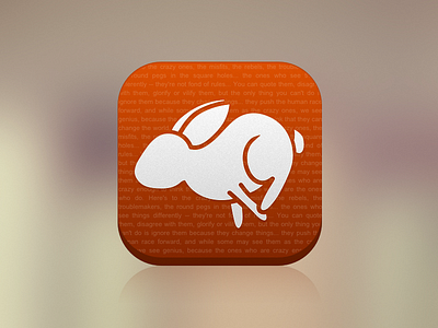
Hey all, working on an icon for an upcoming app, and while I like where I'm going with it, I just feel it's missing something(s) that I can't quite put my finger on. Could anyone offer me some advice on how to spice it up and make it into a more eye-catching icon?
For the style I went for a more minimalist look inspired by the new iOS 7 icons and all the redesigns created here.
Any and all input would be greatly appreciated. :)