


Steam Store Page Redesign (1/2)

A redesign of the Steam game store page from 2015 (1 of 2) – another item dug out from the archives.
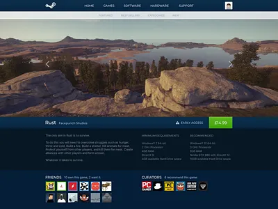
Key information about the game is all easily skimmable in the top part of the page, shown here.
Focus was placed on the main video/screenshot carousel as it's the first content on the page you're typically drawn to. Perhaps the thumbnails for the other available videos/screenshots to view could have been shown too though.
Friends and curators are right below the description and requirements as they're usually an important influencing factor in a purchase, besides the price , which is situated further towards the top than the current official design.
Probably not enough emphasis on purchasing, like bundles and alternative pricing options, to actually be viable though!


