New user guide

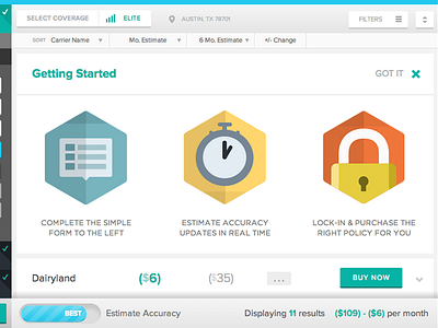
When a user hits the /compare view of our app for the first time, we're going to insert a 'Getting Started' card up top with a few bullet points. Users can scroll past the card, or close it to watch the carrier rate cards shuffle into place (thus explaining how the space/pattern actually functions).
Huzzah!


