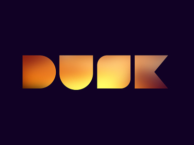
Which "S" is best? (Dusk Interactive)

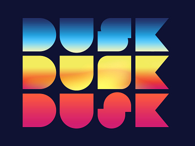
So, I've had a couple comment that the "s" on the middle version of this logo isn't legible enough so I came up with a couple alternates. Personally I don't mind people having to work a little to see the "s" i kind of feel that it gives them a "reward" when they identify it.
Please reply with your vote on which "s" you like best.