Vine iOS 7

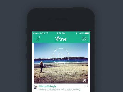

With a bit of inspiration from @Ben Bate ⚒ I decided to do a bit of a redesign of Vine app for iOS 7. There's just some things that bother me about the current app, like on the left hand side where they leave lots of space in the comments part, that space could be used in a much better way. In the attached file, the green "comment" icon is the pressed state.
Check out x2
And holla at me on Twitter machine and follow me on Instagram


