iOS Keyboard

I made some changes to the iOS 7 keyboard that I feel make it an improvement.
View full: http://mdznr.com/b7
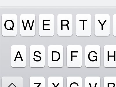
I made the font Helvetica Neue Regular, instead of light, so that it is more readable, especially out in the real world, when lighting conditions aren't ideal, and the device is moving (while the user is walking, on some form of transporation, or just the movement of the device in the typing hand). I manually tweaked the fonts to be a bit sharper, too.
I blurred the shadows so that it gives the user a better perception of depth. The original keyboard had a sharp shadow vertically offset by 2px.
I added a very slight gradient to the keys and keyboard.
I added a slight inner shadow and gradient on the keyboard frame itself so that it stands out and above the content, instead of on the same plane. Now it makes more sense when content flows beneath it or the keyboard slides up above content.
I changed the colors of the other buttons. They no longer look like they're in a disabled state. All buttons look enabled.
Some of the glyphs, like dictation, were not centered properly, so I fixed those as well.
Warning: This was put together in a short period of time. I realise it's not perfect. I'd love to hear your crituques and suggestions.


