App Store

View full: http://mdznr.com/ca
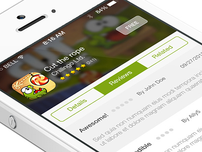
I thought the background was a very interesting idea to add some more differentiation and branding to the very crowded App Store.
I thought the app icon on the App Store is too unnecessarily big. Making it a bit smaller allows for more room for text. I made the text bigger and more readable.
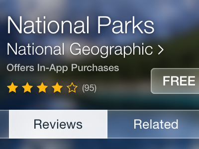
I rounded the edges of the fill in the progress for each ranking because it makes it even more obvious which one is the fill and which one is the track (one problem with flat design). The stars are right aligned, but the progress is left aligned? I made them both left aligned.
I removed the number ranking for reviews because it's not helpful or significant.
I right-aligned the date because otherwise it appears scattered between reviews.