D I F F U S I O N Typography // Variable Type 07/15 - LL

Typography Exercise ⠀
⠀
This side-project is meant to be an exercise on the logo trends of the year. As I've said on the previous posts, my motivation is just to study the trends and hopefully create interesting concepts using it as platform, experience some new styles, etc. I hope you enjoy this project with me (feel free for check the 1, 2, 3, 4, 5 and 6)!
(also I haven't any logo selected for this years publication, so maybe resentment could be a bit of motivation agent here haha) ⠀
⠀
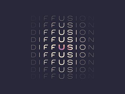
I love to work with custom type, this one is made from scratch. I've done this way because is very hard to get this gradual transition effect with font sizes variation. So, type done in bezier strokes gives me the chance to experiment with it size and I can distribute it in this matrix to convey the idea of 'diffusion' visually. The idea here is pretty simple, just a play with U at the center of the diffusion, and a relation with US.
⠀
I don't know even if this is suitable as a logo, although there's a simplified version in one color; maybe is too complex in terms of design and also a complex concept behind it. What do you people think? Would be nice to hear what you see on this concept :)
⠀
Plus, I've decided to work on a fictional concept for each of the sections created for the Logolounge 2020 Trend Report.
So I'm excited to try this new stuff and hope you guys enjoy this quick journey with me as well! ⠀
⠀
The description of the trend I'm following on this shot is above, I'd love to keep the discussion on this topic flow so here goes the text: ⠀
⠀
"When evaluating the lift-off thrust of any trend, success is often measured between the born-on date and the rise to critical mass. If momentum doesn’t build, you’re doomed. On the other hand, popular trends tend to burn out overnight. We find variable type on a strong pace to have an influence on logo trends for some years once we figure out how to drive them. Just this last year, more designers embraced the basic bag of tricks generally reserved for demonstrating variable type capabilities. Diminishing or contorting type in a sequence of thick to thins or squat to tall, and even animating it as such, are eye candy but probably not the use the original developers of variable type had in mind. In fairness, these fonts weren’t created just for logo designers, but we tend to gladly appropriate shiny things.
Unfortunately, the only time variable type can be identified as such is when it’s shown in contrast or motion. Amsteldok, the WPP offices in Amsterdam, have really done an astonishing job of embracing regional and historic influence for their proprietary font, and have used the variable capabilities to create a highly flexible system. That system manages to hold together admirably, but also is designed to morph and gyrate. It works without appearing to be a slavish demonstration model." ⠀
⠀
(article excerpt by Bill Gardner) ⠀
⠀
Let me know what you think about this work, my friend :)
Feedback is really highly appreciated!


