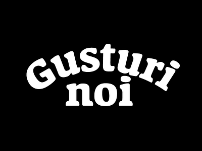
Gusturi Noi Lettering
Hello everybody! It has been quite a while since my last post – I've been busy setting up a small lettering business and a website (which will be completed very soon).
This is a new line of preservative-free all-natural breads. The lettering for the logotype has this particular layout (the two words are stacked and the upper one follows an arch) for a few reasons. The arched letters suggest rays and growth. Furthermore, “Gusturi” fills an empty space at the sides of “noi”, a very short word that would otherwise look very lonely. The logotype and tagline fit in a cartouche that resembles a loaf of bread. Because of the tittle (the dot above the “i”) in the second word, there is an empty space above the “n”. To make this space as small as posible and keep the logotype balanced, I have drawn this tittle asymmetrical, with a squeeze on the right side. The serifs are thick and rounded, to give them a bread dough consistency.


