Comparing O-o
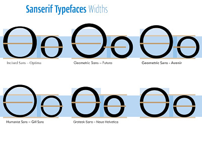
Working on a presentation about a new typeface started last july for a client, I have to explain how the new O and o I'm designing (the last ones without any indication!) are proportionally correct, so similar to existing O and o. ETC.
Not sure this page 26 of the presentation will be exactly like that, but that's another story.
notabene: Captions are legible only on Retina screens :)


