Typography Study

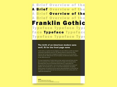
I've been working on a Graphic Design Certificate through CalArts, and have really fallen in love with the typography material. This tabloid poster focusing on a particular typeface was an exercise that was a part of the final course project. I was trying to evoke the newspaper and information-oriented usage of the typeface from its origins, and I wanted to connote its early 20th century forward-looking modernism.
The result looks more like a book cover, and think the lemony yellow might have been too bold, but am overall really happy with the composition.
Product designers these days are expected to have an incredible swath of skills. As a product designer with a deep background in strategy, analytics, and interaction design, this program has really helped accelerate the graphic design knowledge I've been learning on the job the past several years (I also have had the privilege of working with some talented graphic designers who properly studied this stuff in college at schools like CCA - osmosis is a thing!). Grateful for CalArts and its digital professional education opportunities :)


