Splash & Home Screen - Spirit Website

Hello, Dribble!
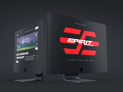
The splash screen is designed around the 60:30:10 rule. This rule of thumb is derived from Interior Design practices and applies well to visual design as well. It states having the primary, secondary and accent colour in the ratio of 60:30:10, in this case, screen area of Black, Red and white helps in establishing contrast and hierarchy.
The other rule of thumb of establishing contrast with volume of 1/3 works best for shapes with same colour but not so much in case of elements with different colours.


